
The branding process for Sushi Soul focused on developing a distinct and authentic brand identity. My objective was to build a comprehensive visual system to distinguish the restaurant within Warsaw’s premium dining landscape and invite guests into the world of Head Chef Mariusz Melcer.
The challenge lay in balancing functionality with an aesthetic that resonates effectively in the physical space of Fort Piłsudskiego as well as across digital channels.
Project pillars:
• Foundations: Brand strategy, naming and visual narrative concept.
• Identity: Typographic logo and brand mark, aligned with the brand’s positioning.
• Key Visual: A visual identity system encompassing colour palette, typography and custom graphic motifs.
• Implementation: Design of print materials and digital assets.
• Support: Workshops and ongoing management of visual consistency.
• Foundations: Brand strategy, naming and visual narrative concept.
• Identity: Typographic logo and brand mark, aligned with the brand’s positioning.
• Key Visual: A visual identity system encompassing colour palette, typography and custom graphic motifs.
• Implementation: Design of print materials and digital assets.
• Support: Workshops and ongoing management of visual consistency.
The design process was driven by continuous dialogue, ensuring business objectives were precisely translated into a visual language. The outcome is a system that merges artistic quality with functional design, establishing a solid foundation for the brand across online and offline channels.
| 2023 |
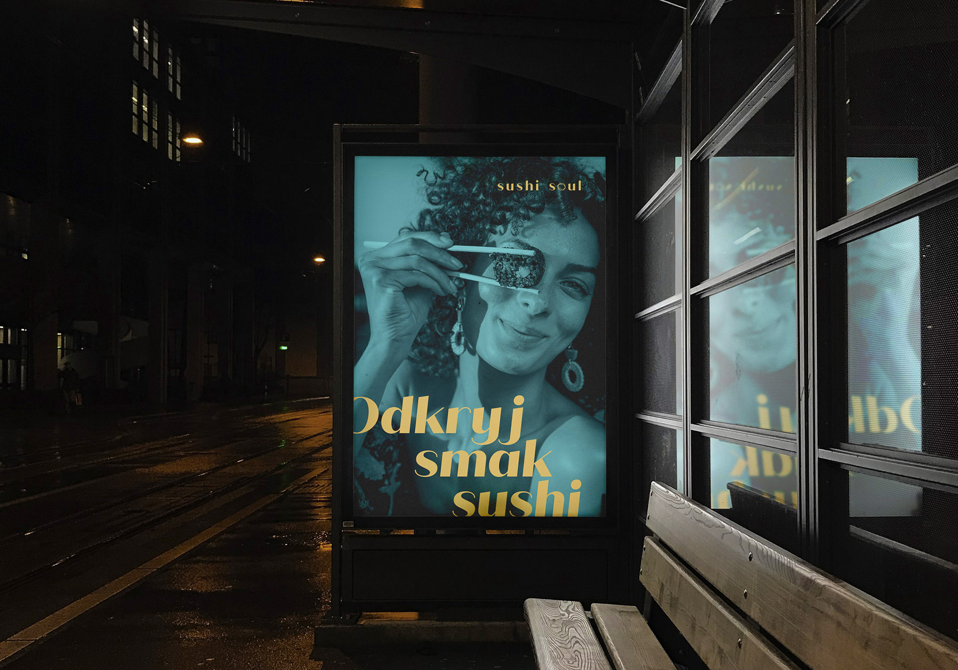
Sushi Soul: A contemporary interpretation of Japanese tradition
Sushi Soul is a boutique restaurant where the spirit of Japan meets the mastery of contemporary fusion cuisine. It is a space for connoisseurs, located within the historic walls of the revitalised Fort Piłsudskiego in Warsaw’s Mokotów district.
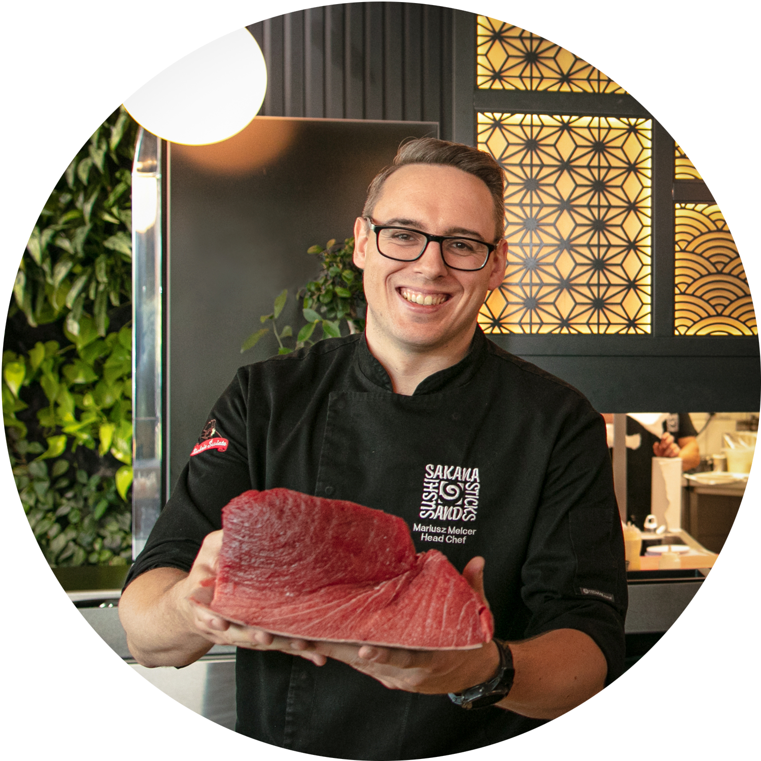
Under the guidance of Head Chef Mariusz Melcer, classic Japanese dishes gain a new dimension through bold, rich flavour combinations. As a Brand Designer, my role was to translate this culinary alchemy into a visual language that reflects the exquisite yet intimate character of the venue.
Foundations: Briefing and verification
I initiated the design process by conducting individual interviews with each of the founders. This ‘blind date’ format allowed me to test the consistency of the vision for the future restaurant. A pivotal moment of the briefing was the joint analysis of the results, presented as a summary during a workshop session. This enabled the verification of responses, the clarification of discrepancies and the definition of roles. This stage became the foundation for the subsequent naming process and the development of the restaurant’s visual identity.
Name and naming strategy
In the naming process for this premium boutique restaurant, I focused on finding a title that moves away from market trends and literal references to Japanese culture. The goal was to find a modern, melodic and understated name, avoiding corporate associations or a food-truck aesthetic.
During a collaborative brainstorming session, we analysed 182 proposals from various semantic categories. The choice of ‘Sushi Soul’ was unanimous. Its ambiguity and elegance perfectly aligned with the principles of original fusion cuisine and defined the brand’s character, serving as the starting point for all further design work.
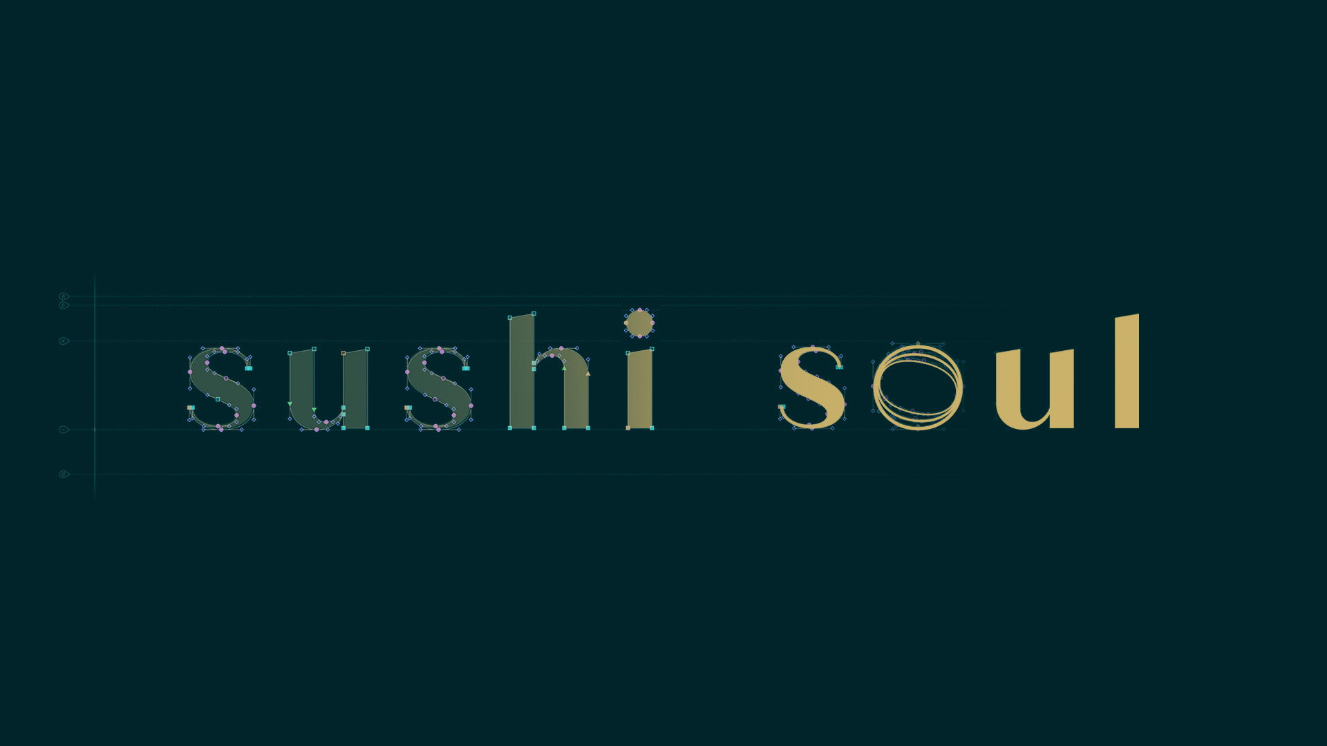
Tone of Voice
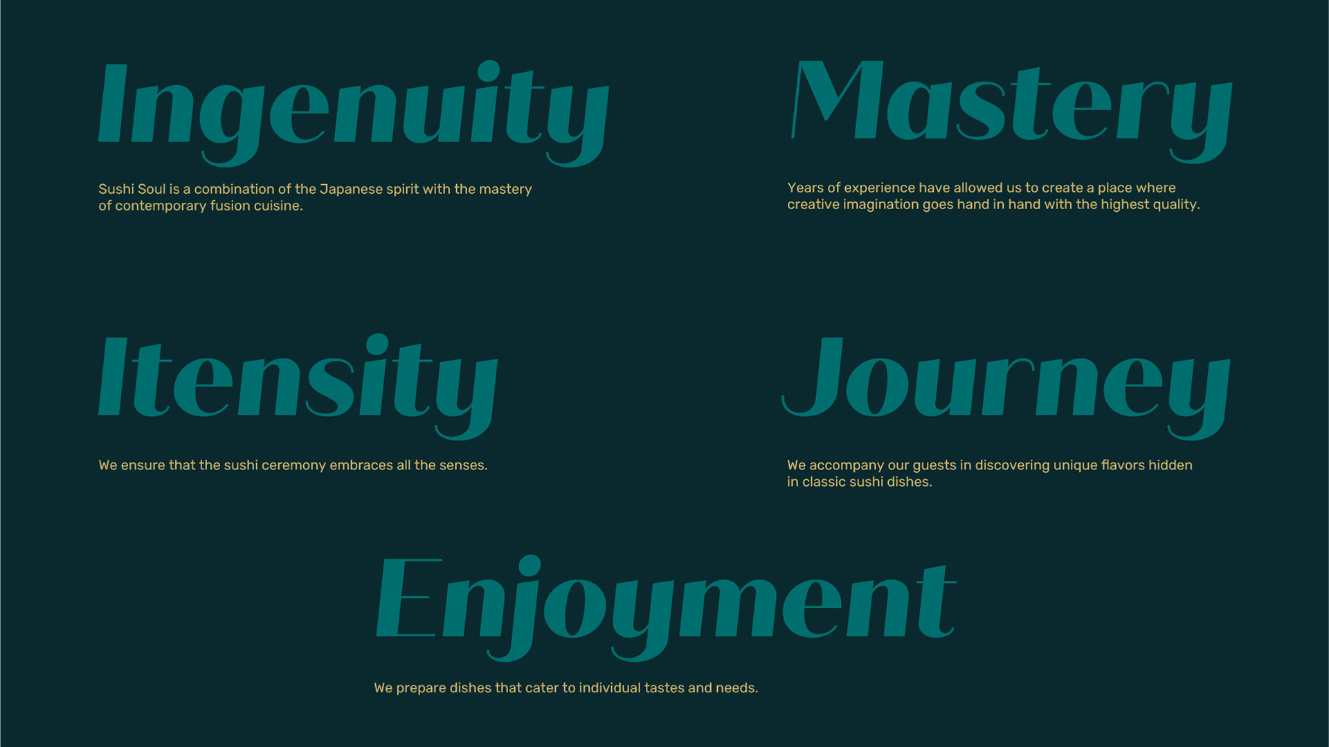
Moodboard and visual concept
I initiated the visual identity development by visualising the brand’s character through a moodboard, which for Sushi Soul was rooted in a synaesthesia of sensations. I translated the flavours and aromas of the cuisine, material textures, atmospheric lighting, and the sounds of smooth jazz into a graphic language.
For the founders, this stage was pivotal; it resolved any uncertainties and ensured complete alignment on the visual direction prior to the design phase.
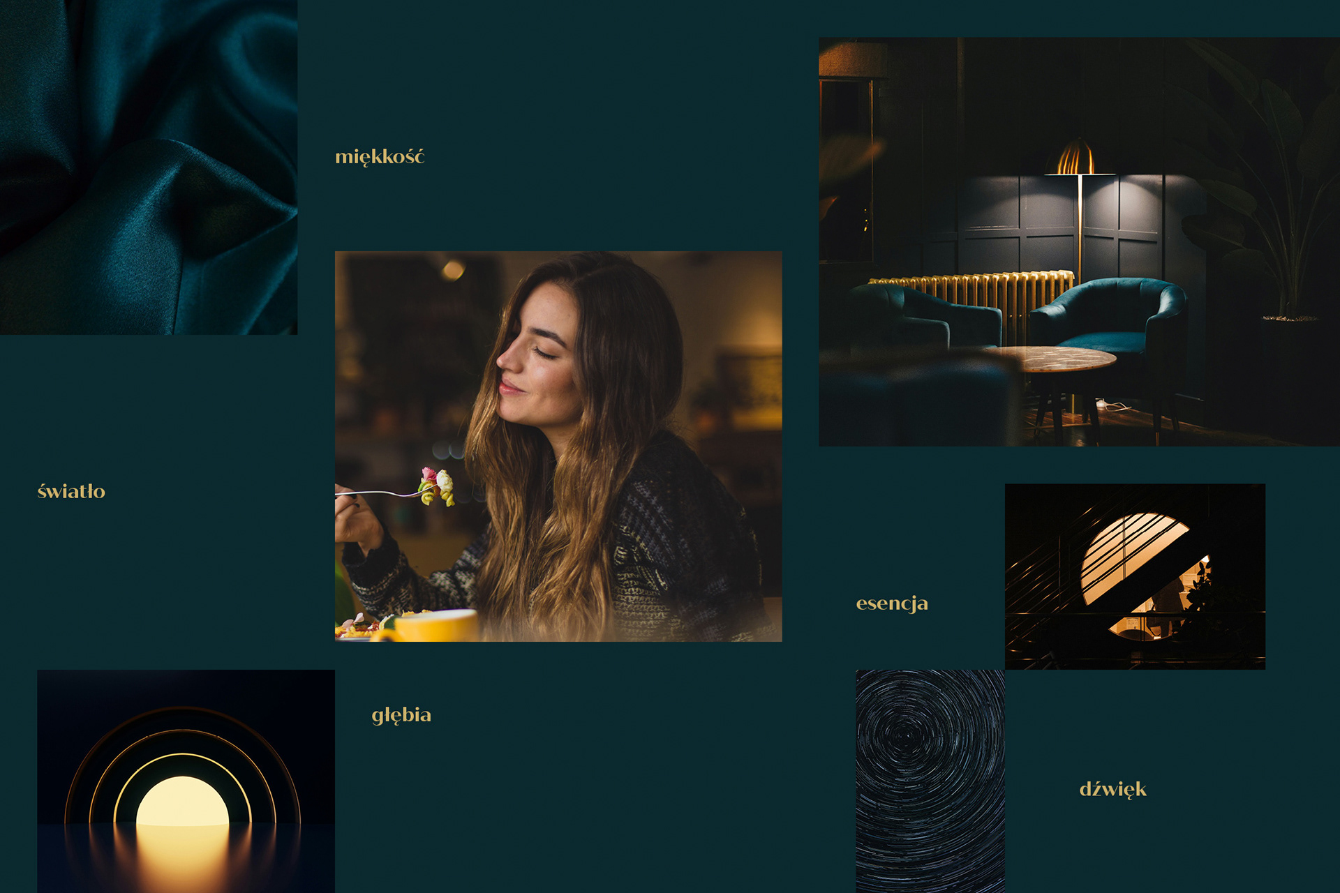
Logotype: Geometry and soft detailing
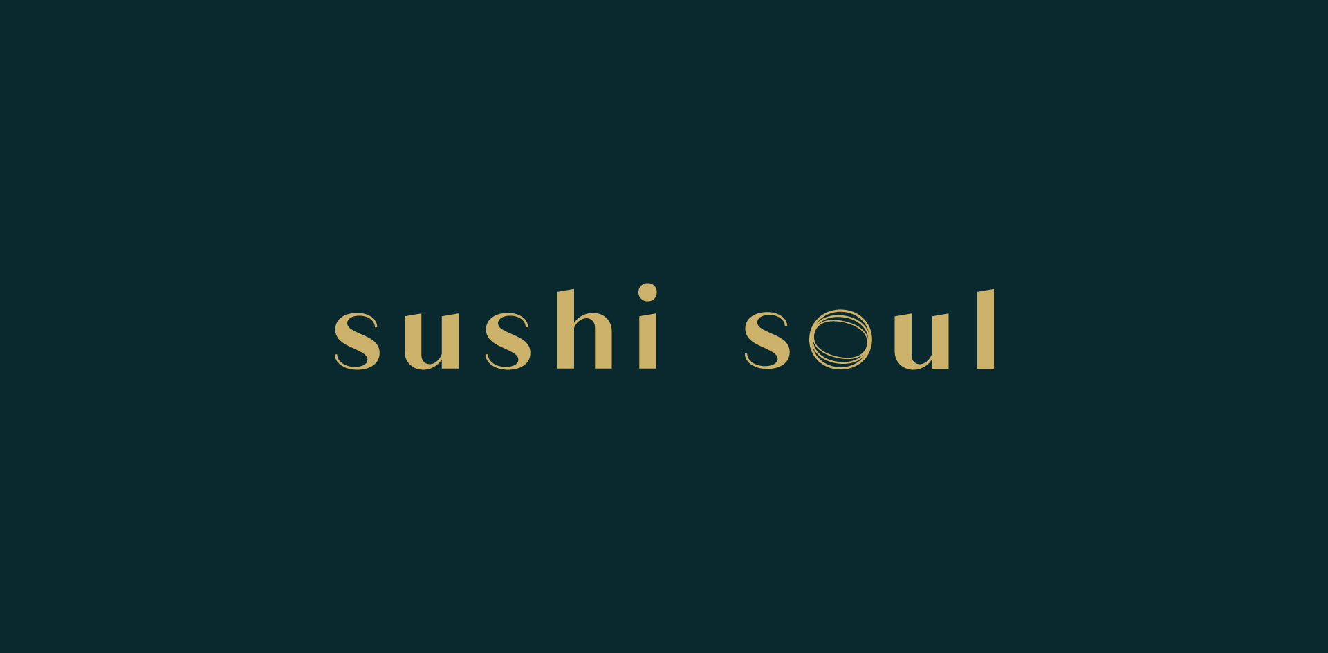
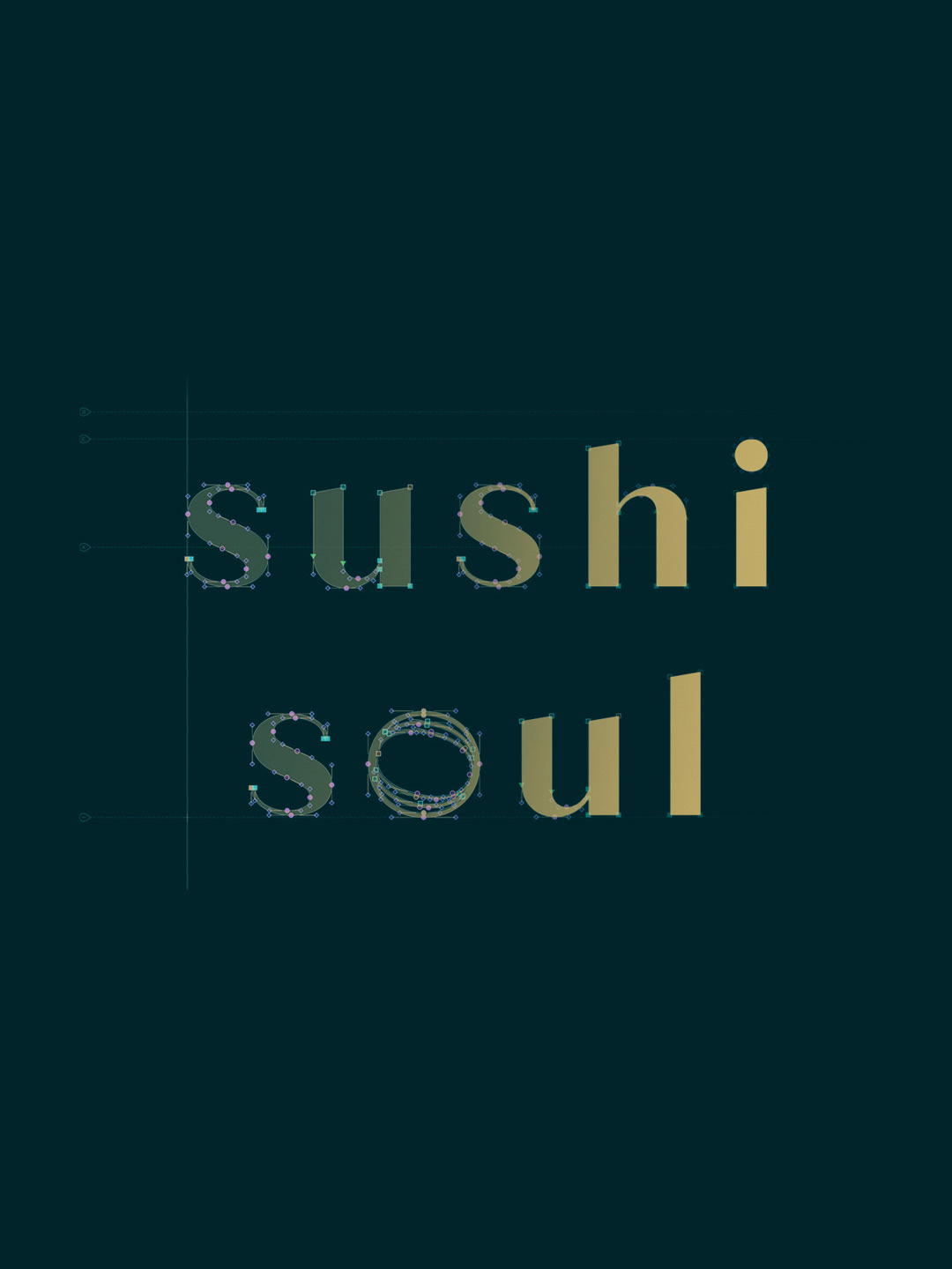
For the Sushi Soul logotype, I selected a high-contrast geometric typeface. Although decorative ligatures were a concept I explored, I ultimately dismissed them as superfluous ornamentation.
The juxtaposition of geometric forms with humanist softness in the details created a distinct logotype that requires no formal distractions. Furthermore, the rhythm and understated form of the mark allowed the terminals to stand out, evoking the fluid strokes of a calligraphy brush.

Colour palette and atmosphere
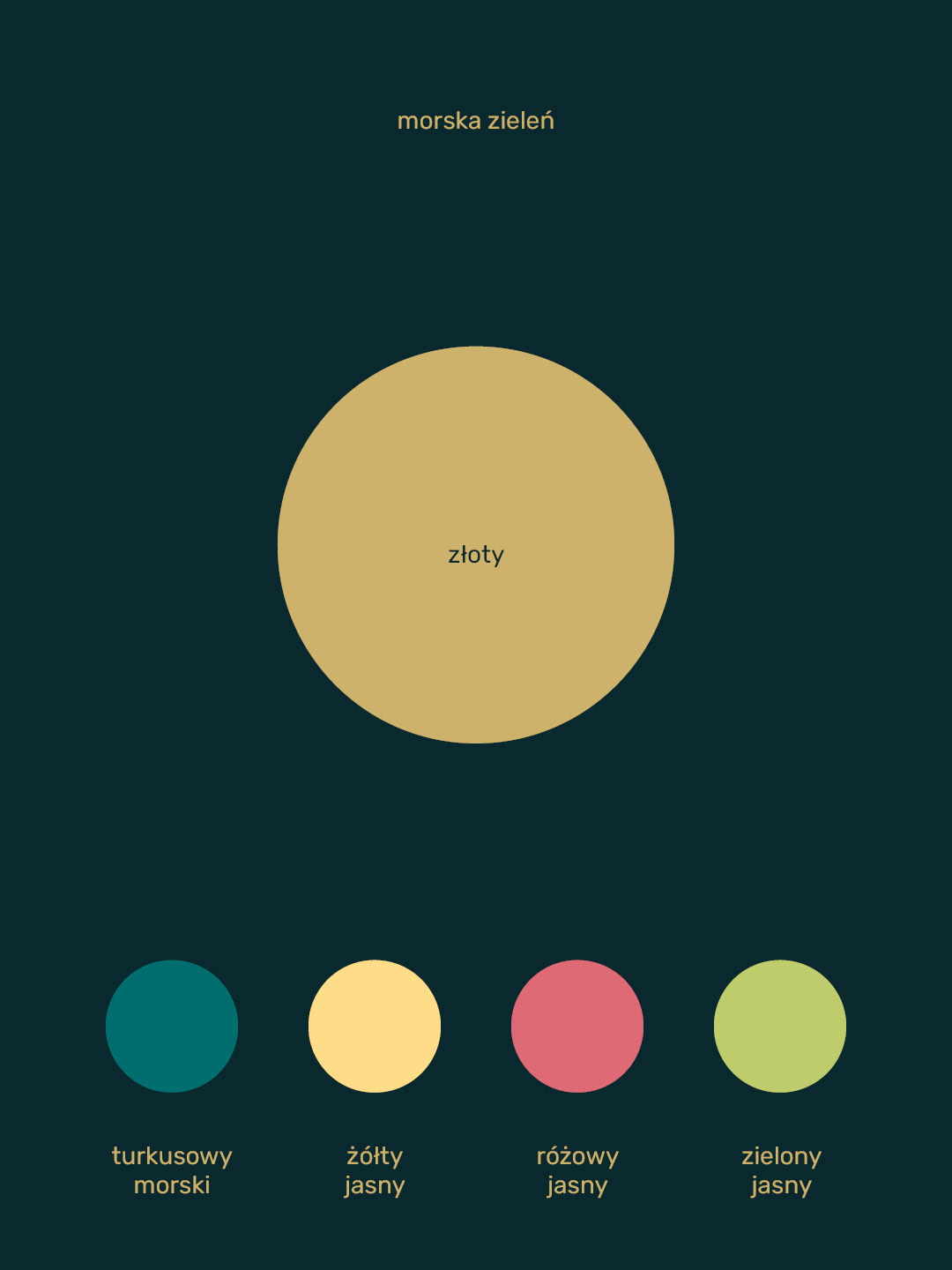
The selection of specific colour combinations extended the concepts established during the moodboard stage. I tested a range of shades to identify those that most accurately reflect the character of Sushi Soul, while ensuring consistency across all customer touchpoints.
The pairing of refined, deep sea green with gold - inspired by the texture of velvet and the interplay of light and shadow - facilitated the development of a premium brand identity that builds atmosphere and engages all the senses.
Typography and readability
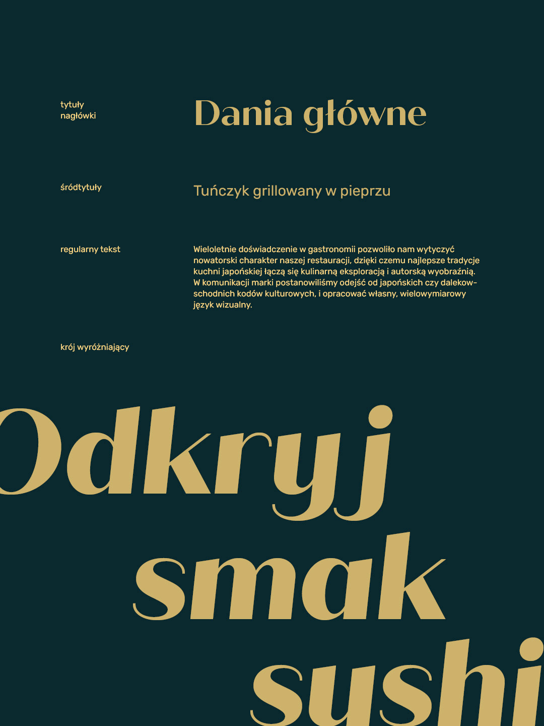
For headlines, I used a geometric typeface featuring humanist curves and elongated calligraphic terminals. The strong, distinctive character of this face necessitated a balance with neutral body typography.
I selected a sans-serif font with rounded corners that echo the details of the headline typeface. This combination ensures a distinct brand identity while maintaining absolute readability across both print and digital channels.
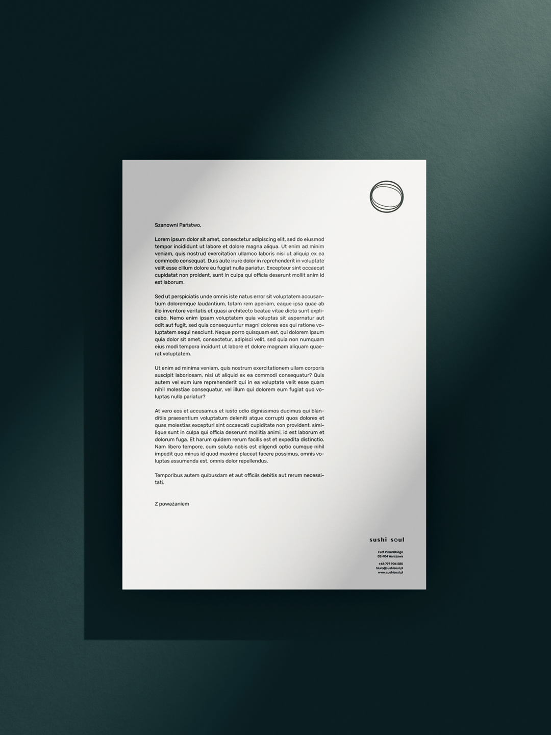
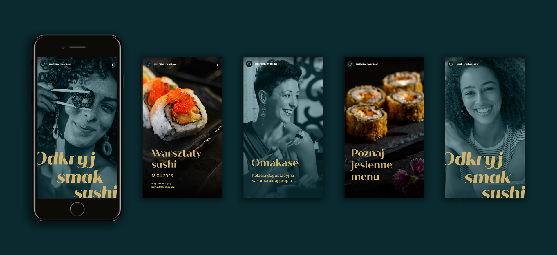
Key Visual and Information Architecture
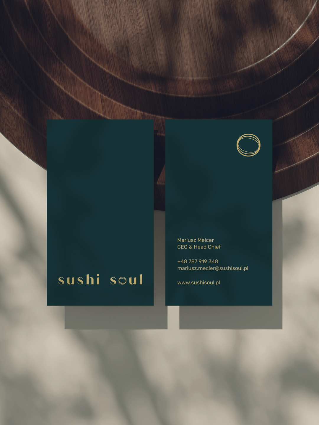
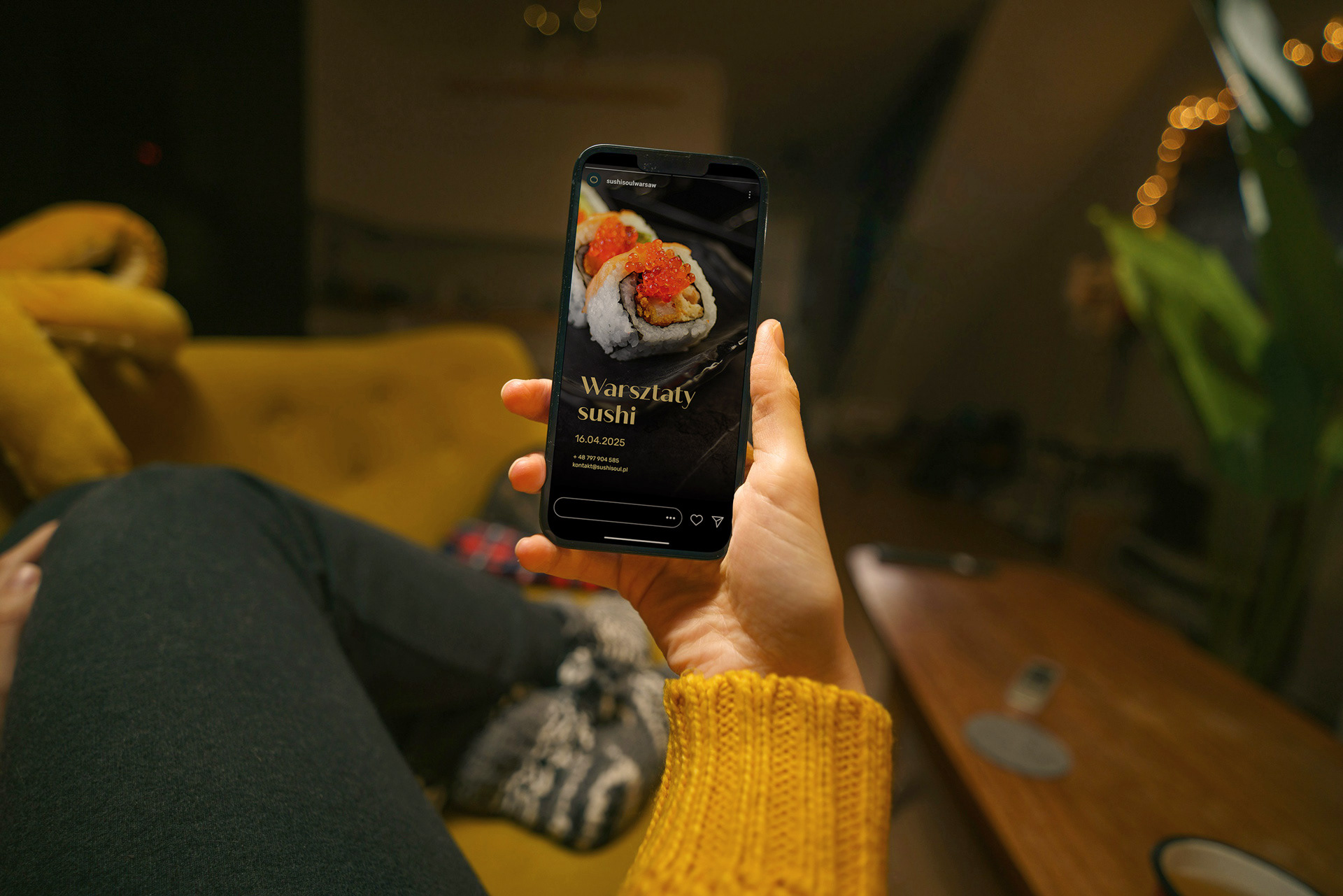
The development of the Key Visual served to establish the final structure of the visual communication. Defining layout principles and typographic hierarchy enabled the creation of a clear information architecture. This ensures absolute brand consistency across all touchpoints, from printed menus to social media presence.
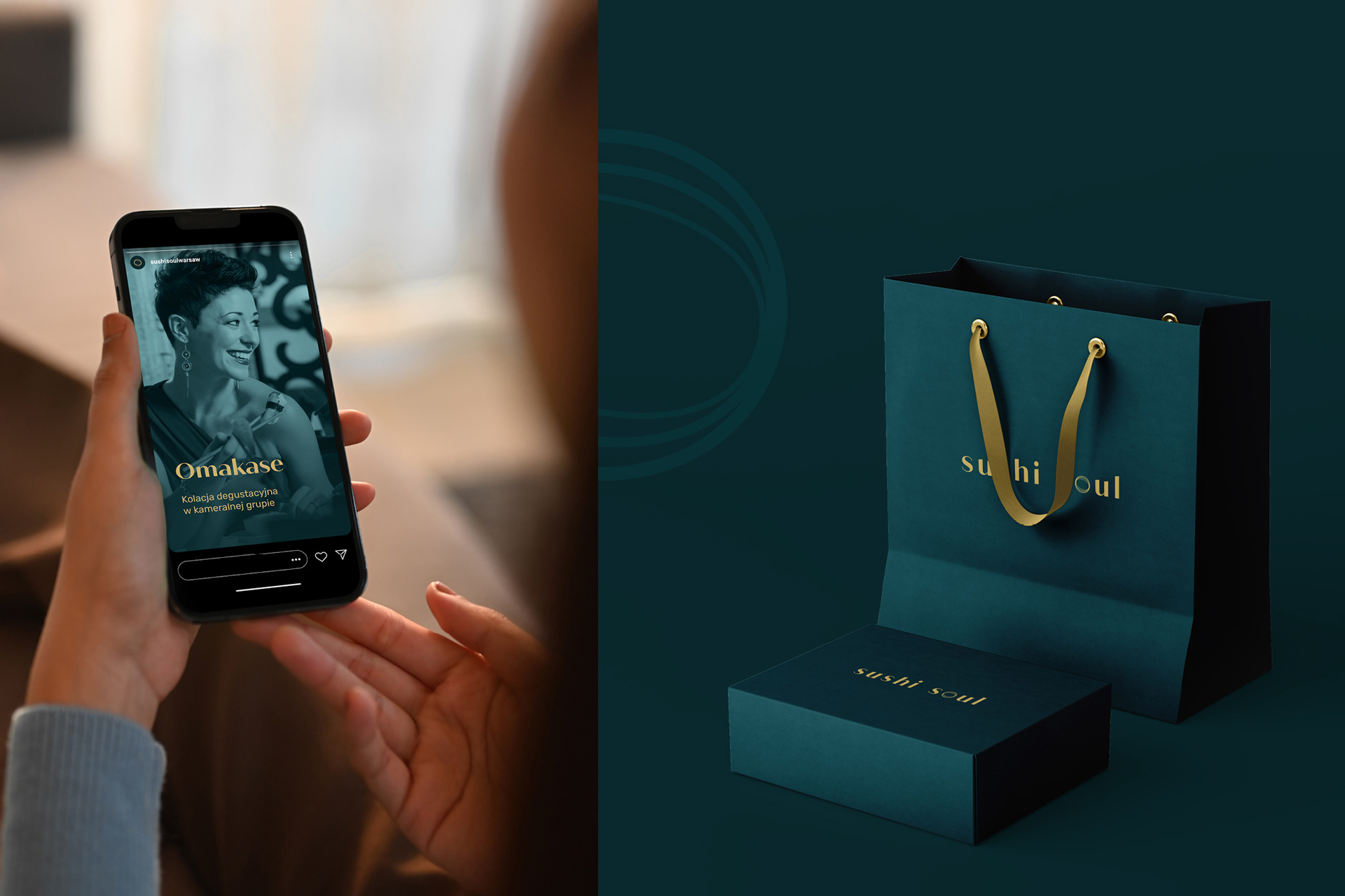
Packaging design: Crafting the brand experience
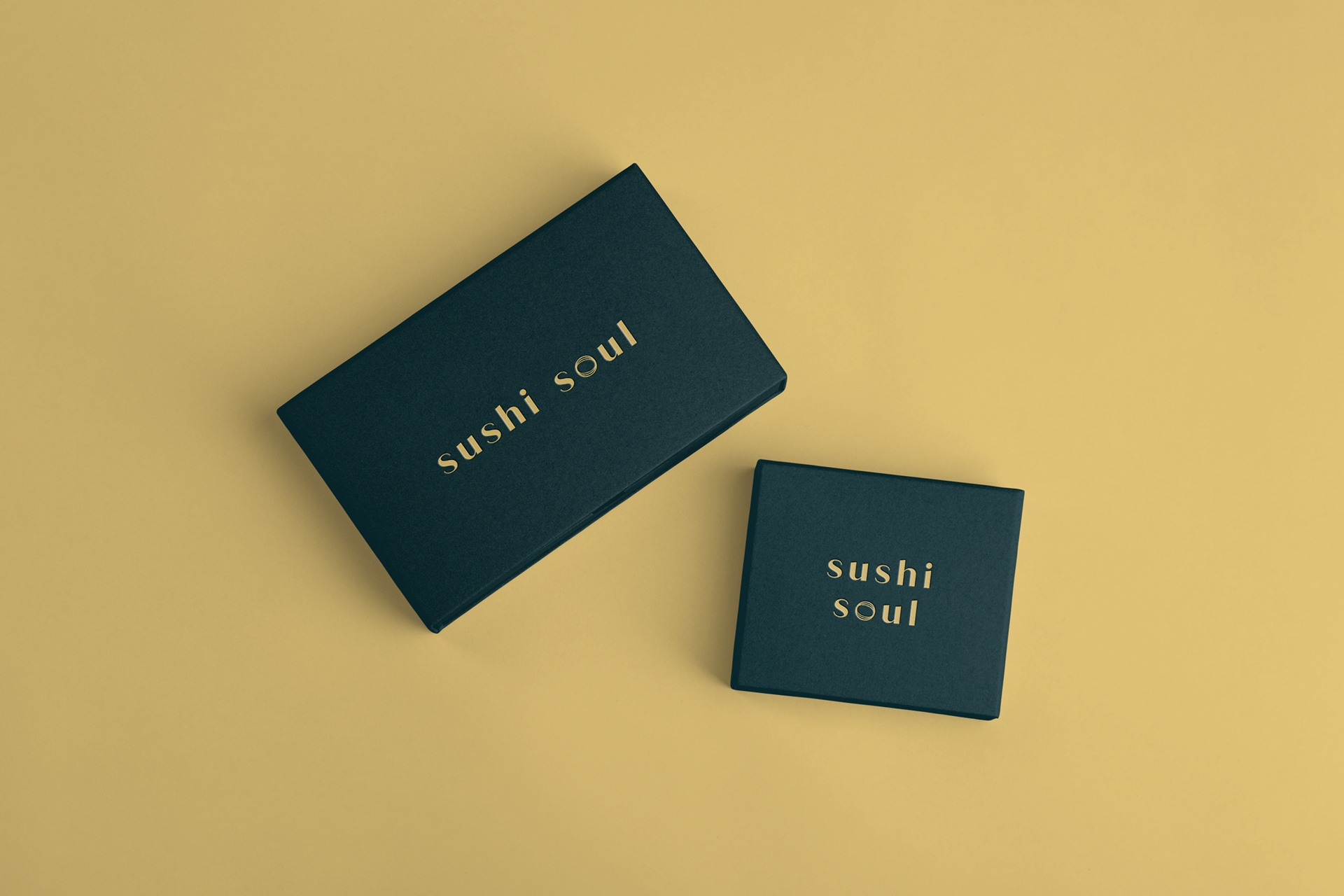
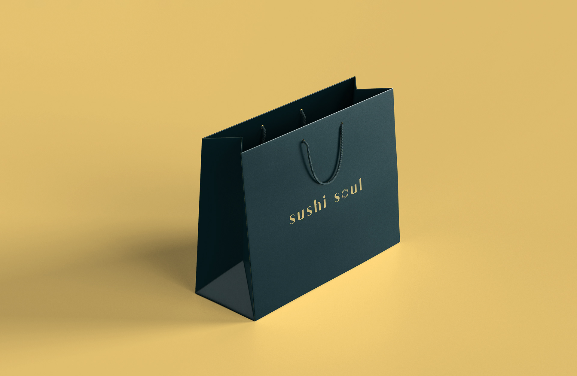
The initial physical interaction with the Sushi Soul brand occurs the moment an order is received. I ensured that the packaging is a vital component of the brand experience, where the act of opening mirrors the unwrapping of a gift.
The selection of materials, the form of the bags and boxes, and the strategic positioning of graphics establish a presentation culture synonymous with the premium segment. This transforms unboxing into a deliberate ritual that engages the senses and reinforces brand standards before the tasting begins.
Implementation system and brand standards
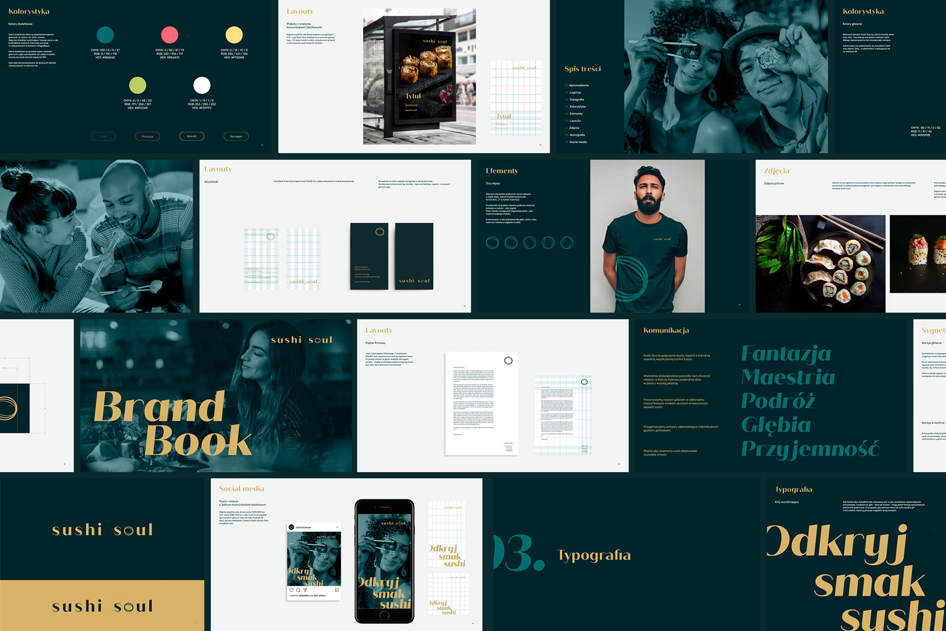
The culmination of the work on Sushi Soul’s visual system is a comprehensive Brand Book. My objective was to deliver a tool that provides the client with full autonomy in managing their assets, while fostering an understanding of the design logic behind the chosen solutions.
The Brand Book contains technical guidelines covering modules, design grids, as well as the brand language and communication style. These enable the adaptation of the Key Visual across various formats—from social media (with a focus on Instagram) to physical touchpoints. A vital section of the Brand Book is dedicated to photography standards: detailed criteria for stock image selection and guidelines for bespoke photo shoots. This ensures the brand maintains aesthetic and conceptual consistency throughout every stage of business growth.

Process efficiency and logic: The making of Sushi Soul
The success of the Sushi Soul branding is the result of an intersection of two perspectives: operational F&B expertise and systemic design. As an Art Director, I translate business objectives into a visual language that not only builds brand image but becomes a tangible operational tool for the restaurant.
Synergy of expertise and expert dialogue
Effective design solutions resulted from close collaboration with the Client. Combining the owner's industry experience with my systemic design methodology allowed us to develop a visual system resilient to the fast-paced nature of the hospitality sector. Consequently, the restaurant’s visual identity is consistent, clear, and supports business objectives at every brand touchpoint.
Transparency and schedule control
My collaboration is built on a clear structure of stages. The logic of the process and an understanding of each step’s purpose provide the Client with total control over the workflow. This organisation eliminates design chaos and ensures the decision-making confidence essential when creating complex brand communication systems.
Adapting to industry requirements
Designing for the hospitality sector demands flexibility. Stage summaries and ongoing communication removed guesswork, while a workflow tailored to the venue’s specific needs ensured timely delivery. As a result, Sushi Soul received a complete visual system—from the logotype and packaging to photography standards—ready for independent implementation by the team.
Client endorsement
I recommend collaborating with Magda with absolute confidence. She is someone who can comprehensively lead a branding project - from concept and strategy to final implementation. If you are looking for a partner to build your brand, you are in the right place.
– Mariusz Melcer, Head Chef & Owner of Sushi Soul –
translated from the original recommendation on LinkedIn
Adapting to industry requirements
Designing for the hospitality sector demands flexibility. Stage summaries and ongoing communication removed guesswork, while a workflow tailored to the venue’s specific needs ensured timely delivery. As a result, Sushi Soul received a complete visual system—from the logotype and packaging to photography standards—ready for independent implementation by the team.
Hi! I'm Magda.
I translate brand strategy into visual language.
Let's talk.
I translate brand strategy into visual language.
Let's talk.