The Loco!Motion branding project involved creating a visual identity system and brand communication architecture from scratch. The objective was to build an image rooted in movement dynamics that structures communication and achieves business objectives across both online and offline touchpoints.
Project Pillars:
• Foundations: Brand strategy and visual narrative concept.
• The Mark: Logotype design aligned with brand objectives.
• Key Visual: A visual communication system including colour palette, typography, and graphic motifs.
• Implementation: Website design, print materials, and digital assets.
• Brand Guardianship: Implementation of visual standards and ensuring long-term brand consistency.
| 2023 |

Personal branding: from ideation to structure
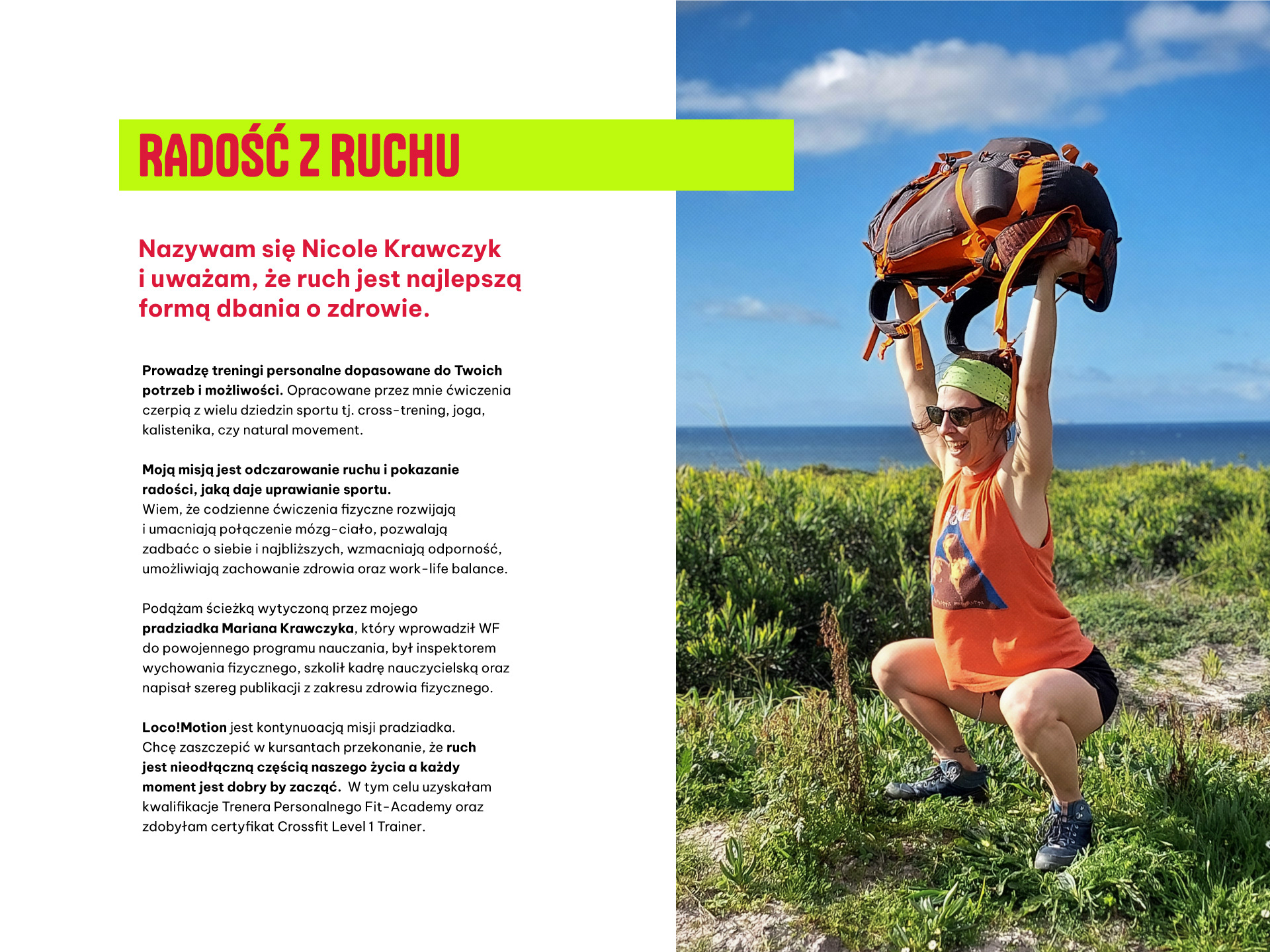
Building a personal brand often starts with an excess of ideas and a lack of priorities. Nicole Krawczyk approached me to organise the vision for her debut brand and translate it into a professional identity.
Briefing: defining brand foundations
Our work began with briefing – a process designed to structure goals, assumptions, and history. It was through this that we uncovered the story of Marian Krawczyk, Nicole's great-grandfather, who introduced Physical Education (PE) to the post-war school curriculum.During the analysis, we defined Nicole’s core values and operational needs. These elements formed the foundation for the personal brand architecture. By bringing this family legacy to the fore, the branding gained an authentic touchpoint for the audience.
Client endorsement
My collaboration with Magda developed alongside the growth of my business. I was just taking my first steps in a new industry and needed my own space on the internet and social media. Magda not only spent many hours with me, asking questions and ensuring she understood my vision for development, but she also continuously proposed solutions I had no idea existed. Magda created a cohesive visual communication tailored to my needs - from color selection, logo design, and typography to creating a website and setting up social media accounts. All of this was done by her with great attention to detail and care. Moreover, she was helpful at every stage, offering advice and helping me feel more confident in the world of Instagram and social media. Working with Magda was incredibly inspiring, and the results exceeded my expectations!
– Nicole Krawczyk, Founder of Loco!Motion –
translated from the original recommendation on LinkedIn
translated from the original recommendation on LinkedIn
The "Small Steps" Strategy
Throughout the design process, I employed a 'small steps' methodology. This concept served as a tool for prioritising tasks and ensuring decision-making clarity. This approach allowed us to navigate every stage of the brand implementation smoothly, without feeling overwhelmed by the project’s scale.
Tone of Voice
Naming
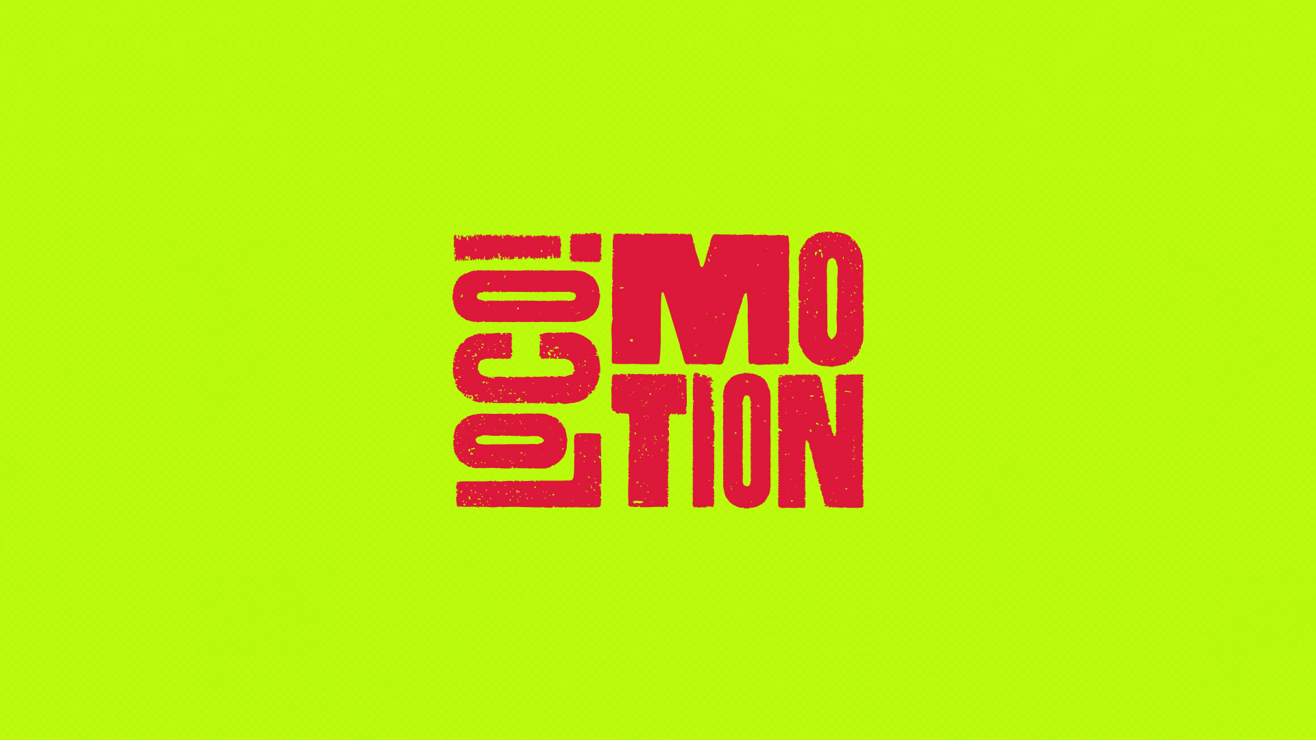
Naming proposals emerged from brainstorming sessions centred on wordplay and associations. Based on years of observation, I’ve found that active client involvement in the naming process yields the best results; therefore, I invited Nicole to participate in this stage. This led to over 90 proposals, with Loco!Motion selected as the final name. The relaxed format of this phase also provided a necessary breather after the intensive briefing.
Visual Foundation
Nicole possesses strong visual awareness, which enabled us to define the forms and colour schemes that best represent the character of Loco!Motion as early as the moodboard stage. This paved the way for a highly efficient design process for the visual core - encompassing the logotype, primary colours, and typography.
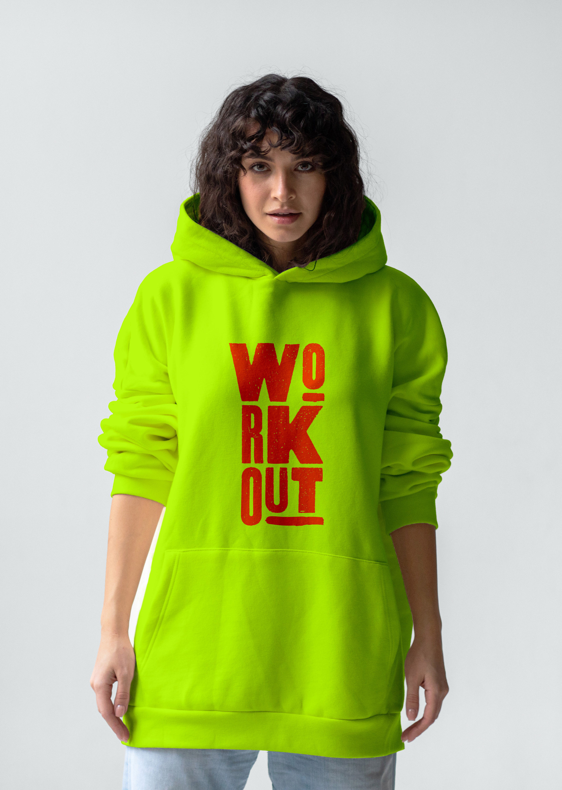
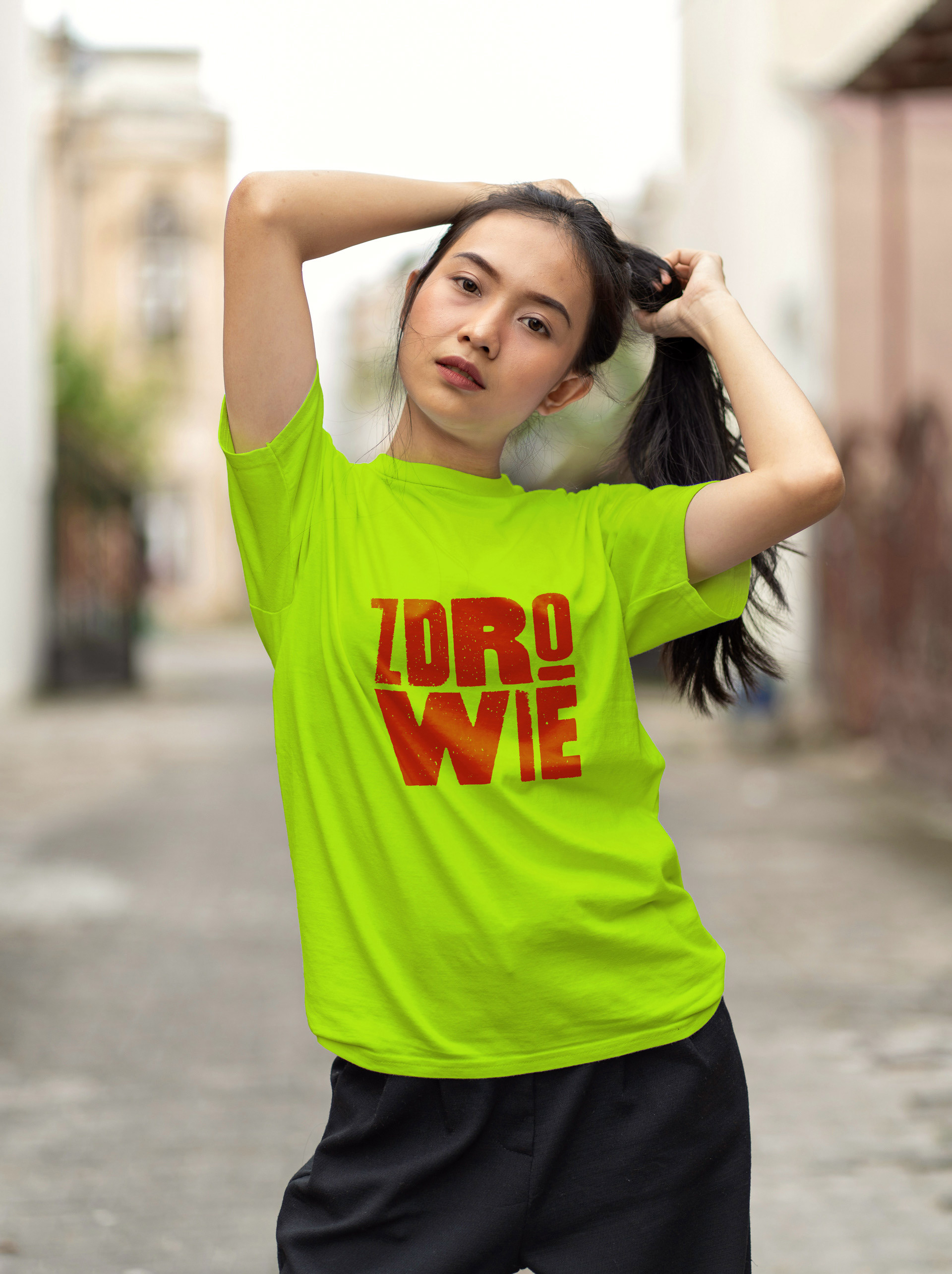
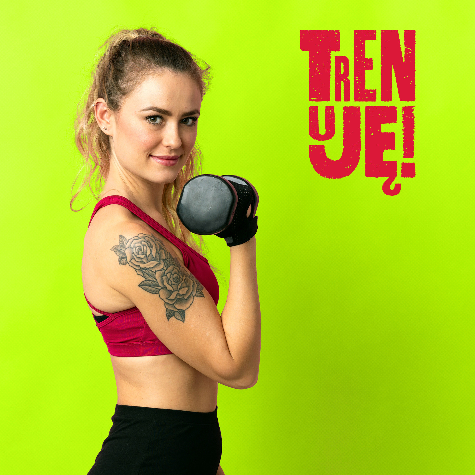
Logotypes
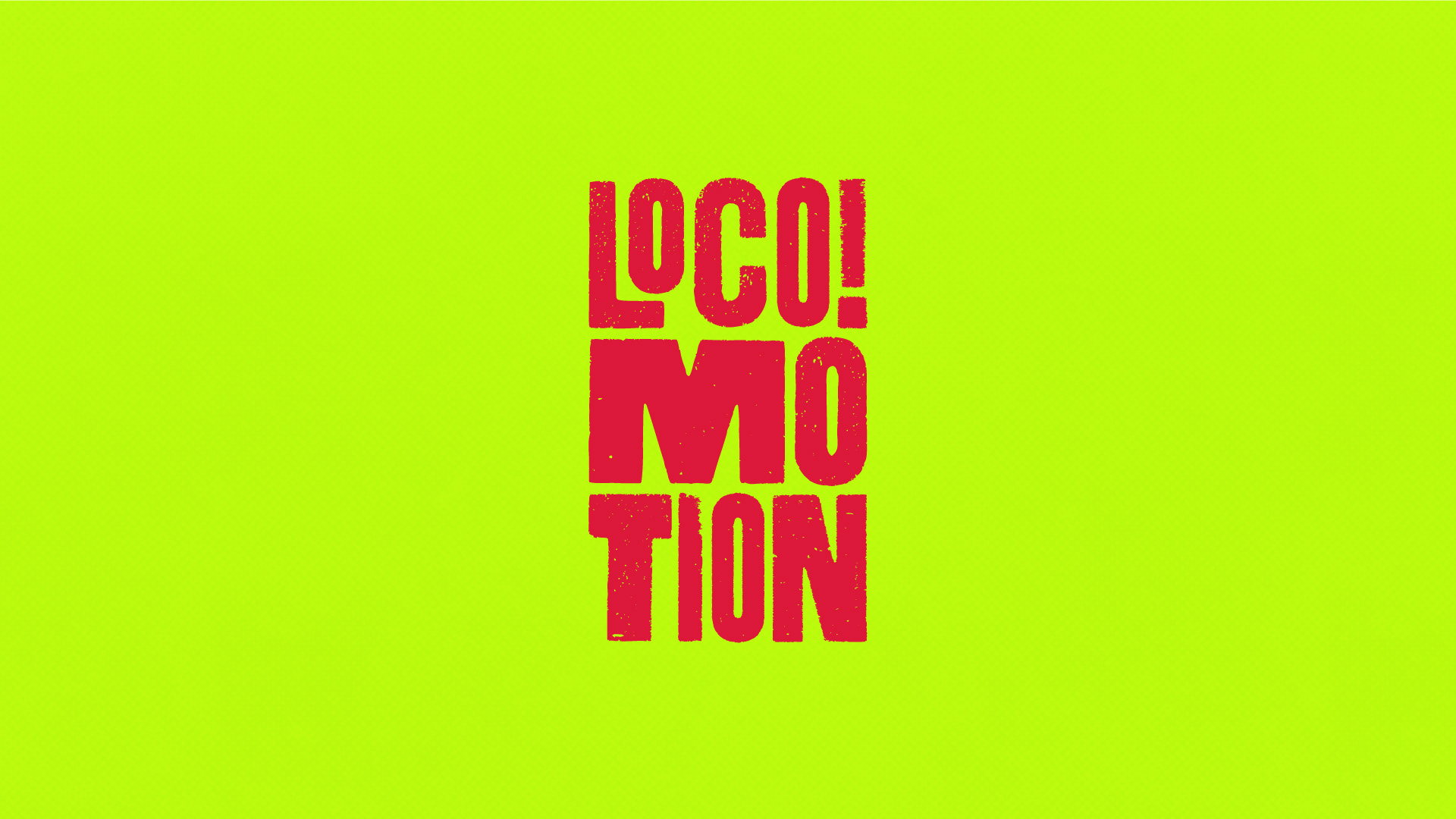
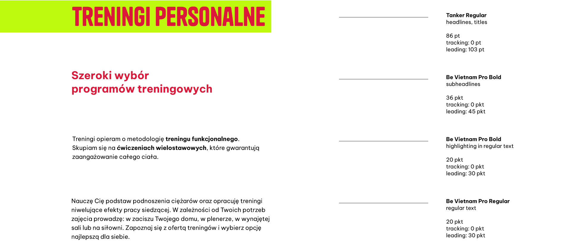
Typography
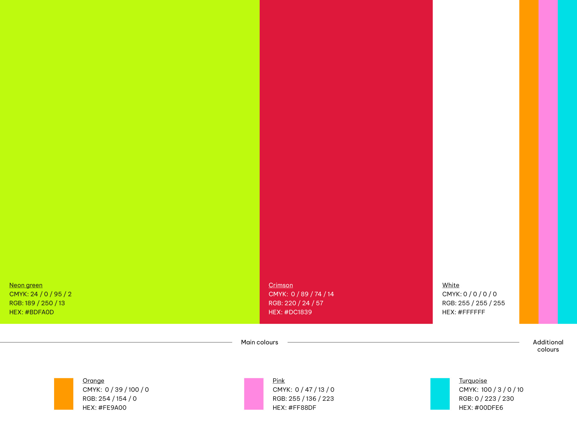
Colour palette
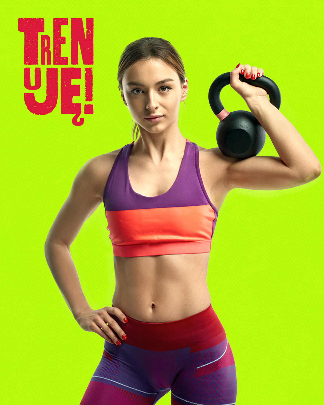
Visual Communication
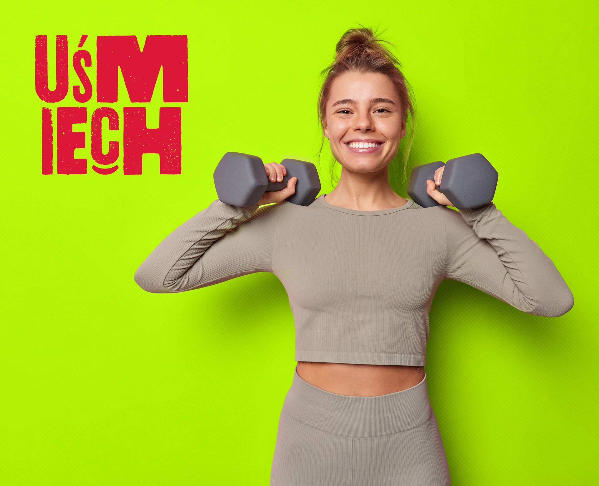
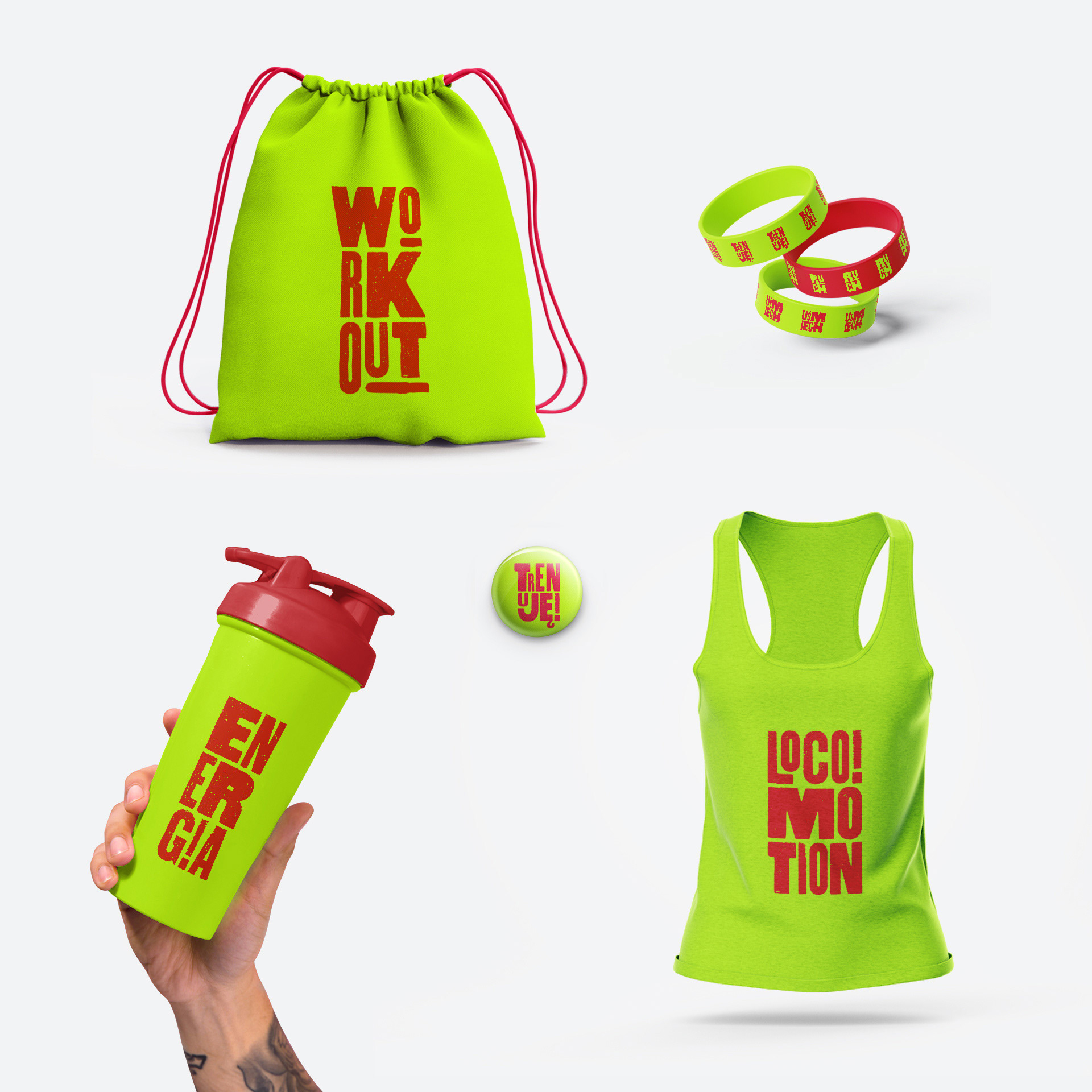
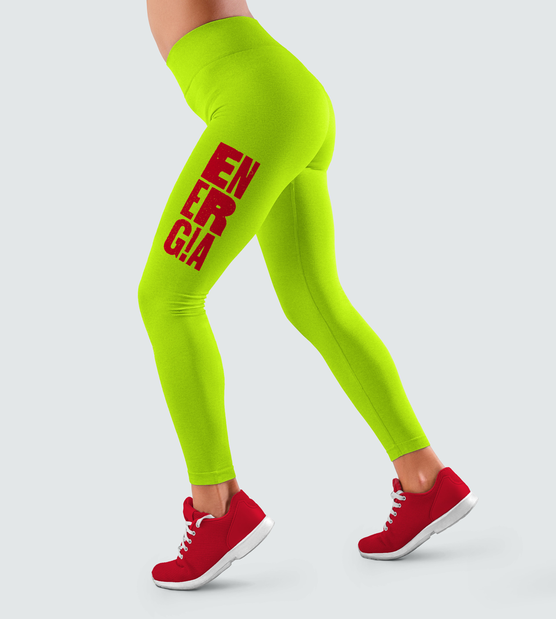
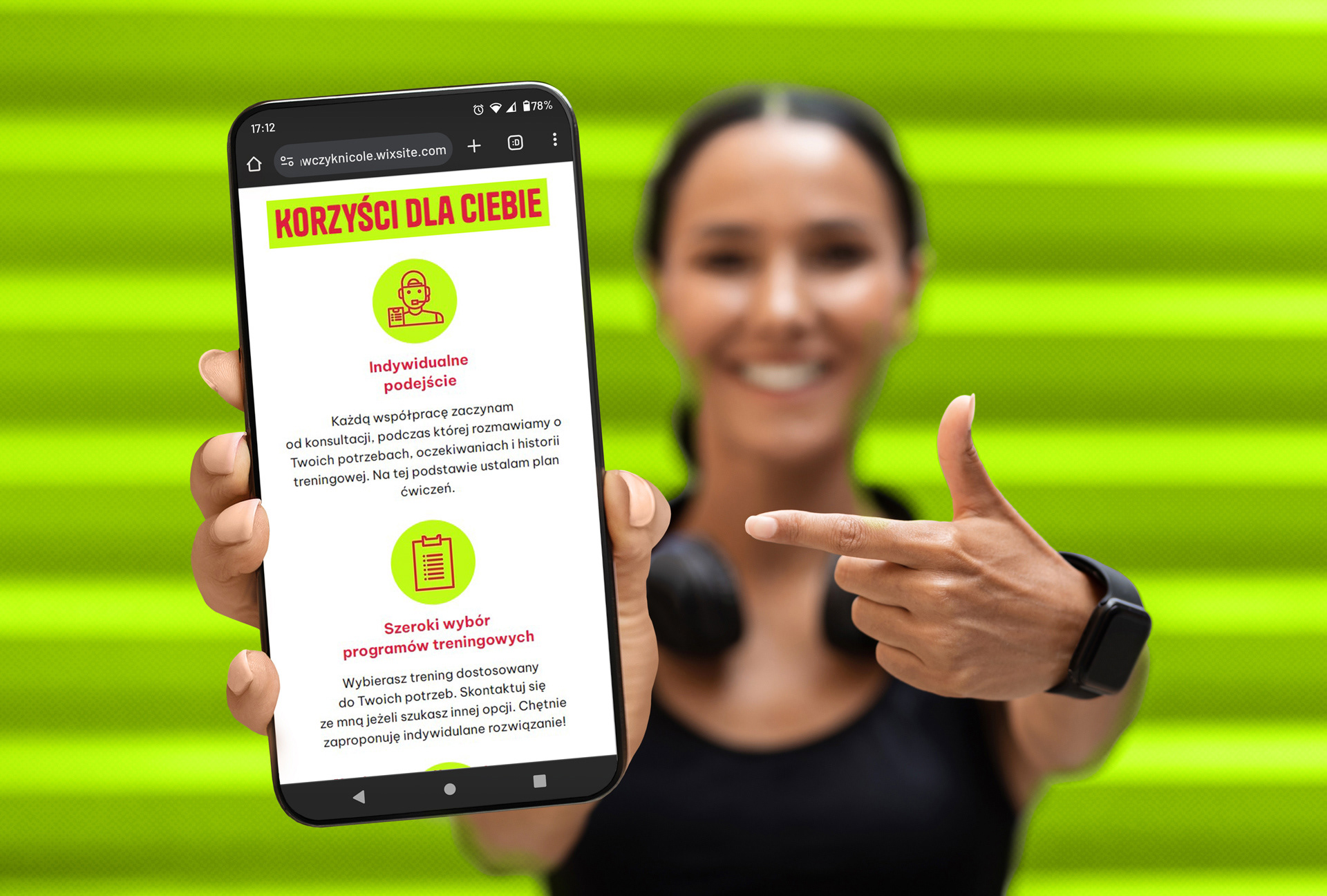
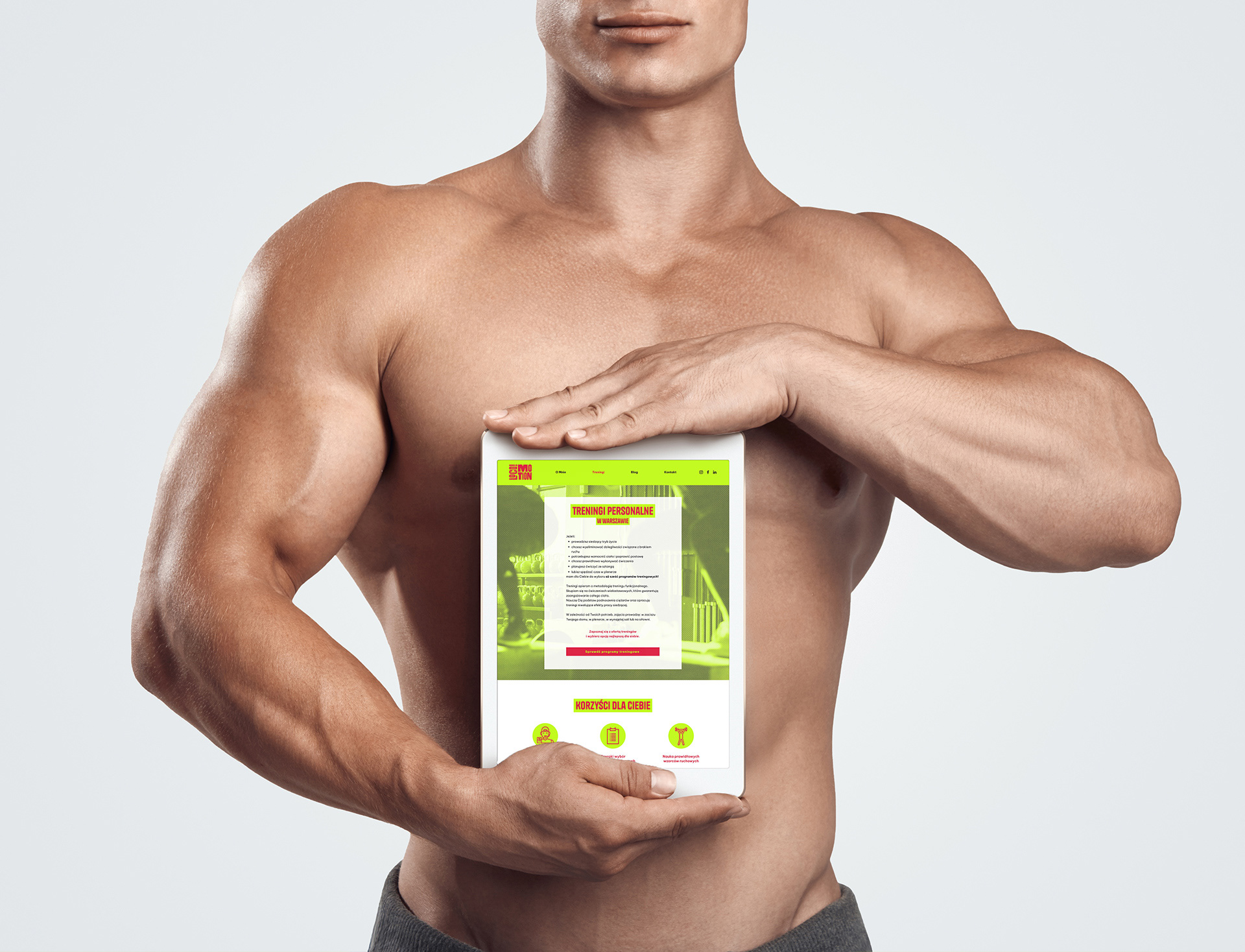
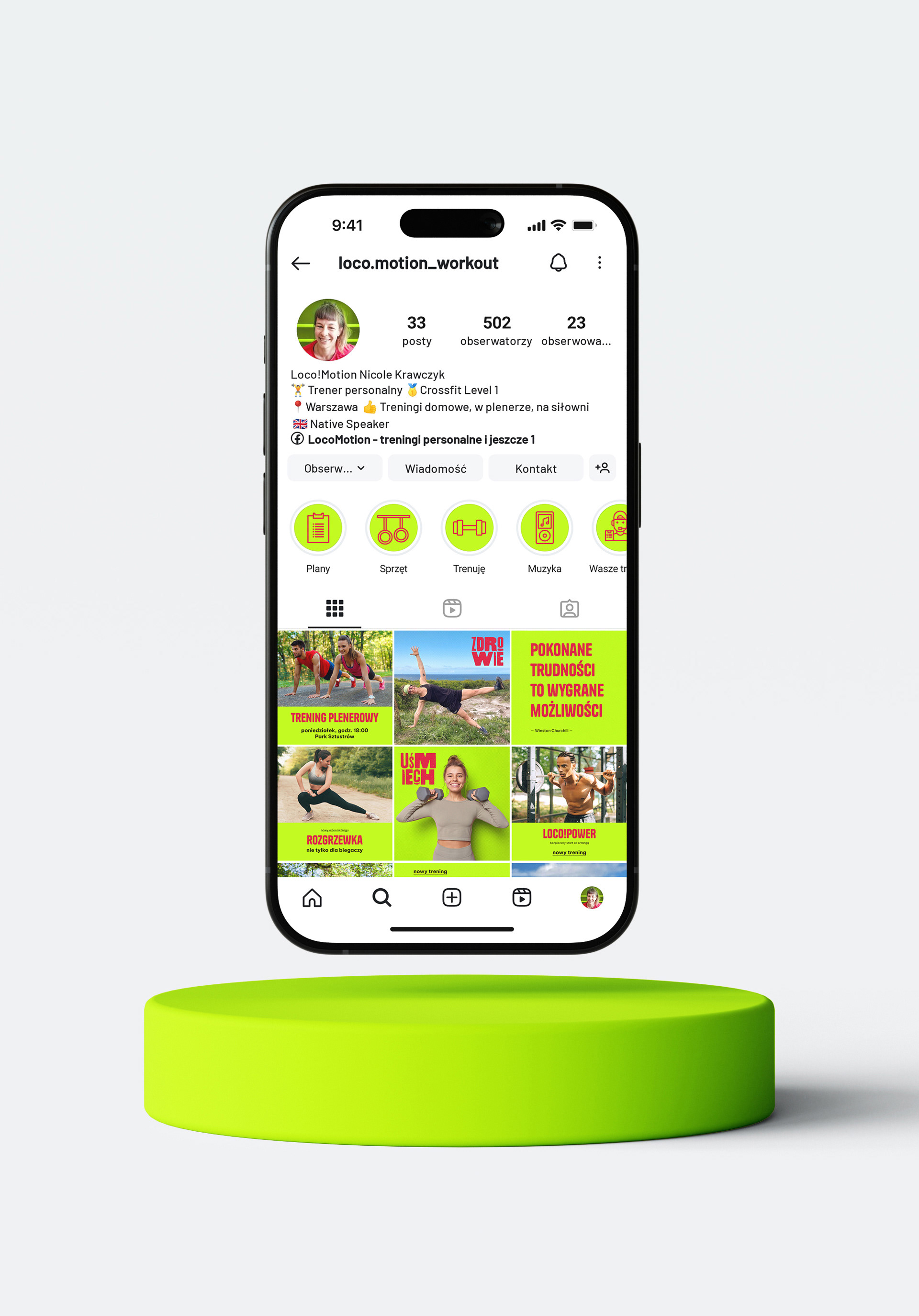
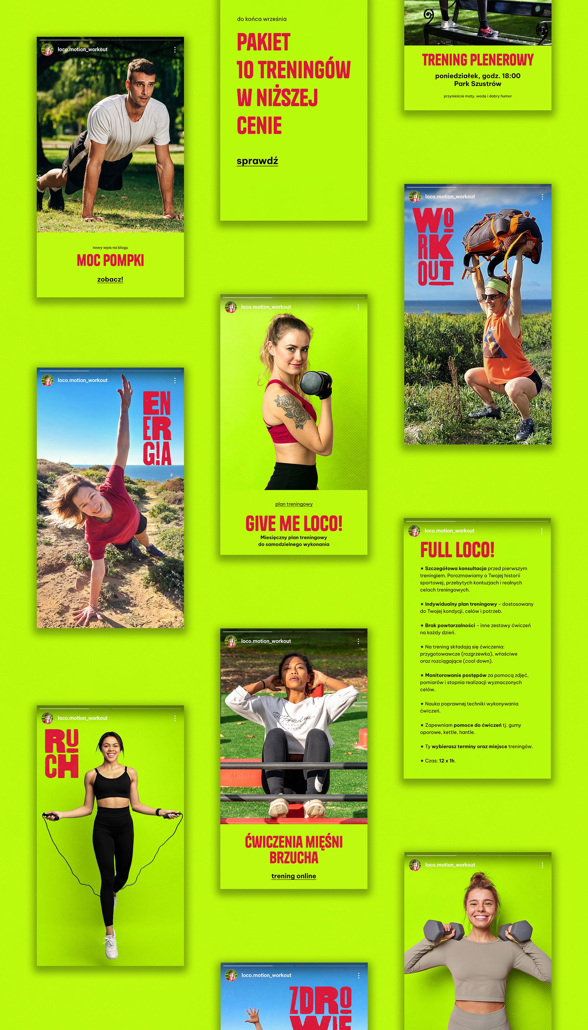
The visual communication components were designed to address the tangible needs of the Loco!Motion brand. Extensive research and competitor analysis conducted during the briefing stage played a vital role in the process. This provided key insights into best practices within the fitness and personal training sectors, allowing me to anticipate the brand's evolving requirements.
As social media - with a primary focus on Instagram - serves as the main communication channel, I developed a comprehensive suite of templates and digital assets for this space. Other areas requiring detailed attention included art direction for photoshoots and selection criteria for stock imagery.
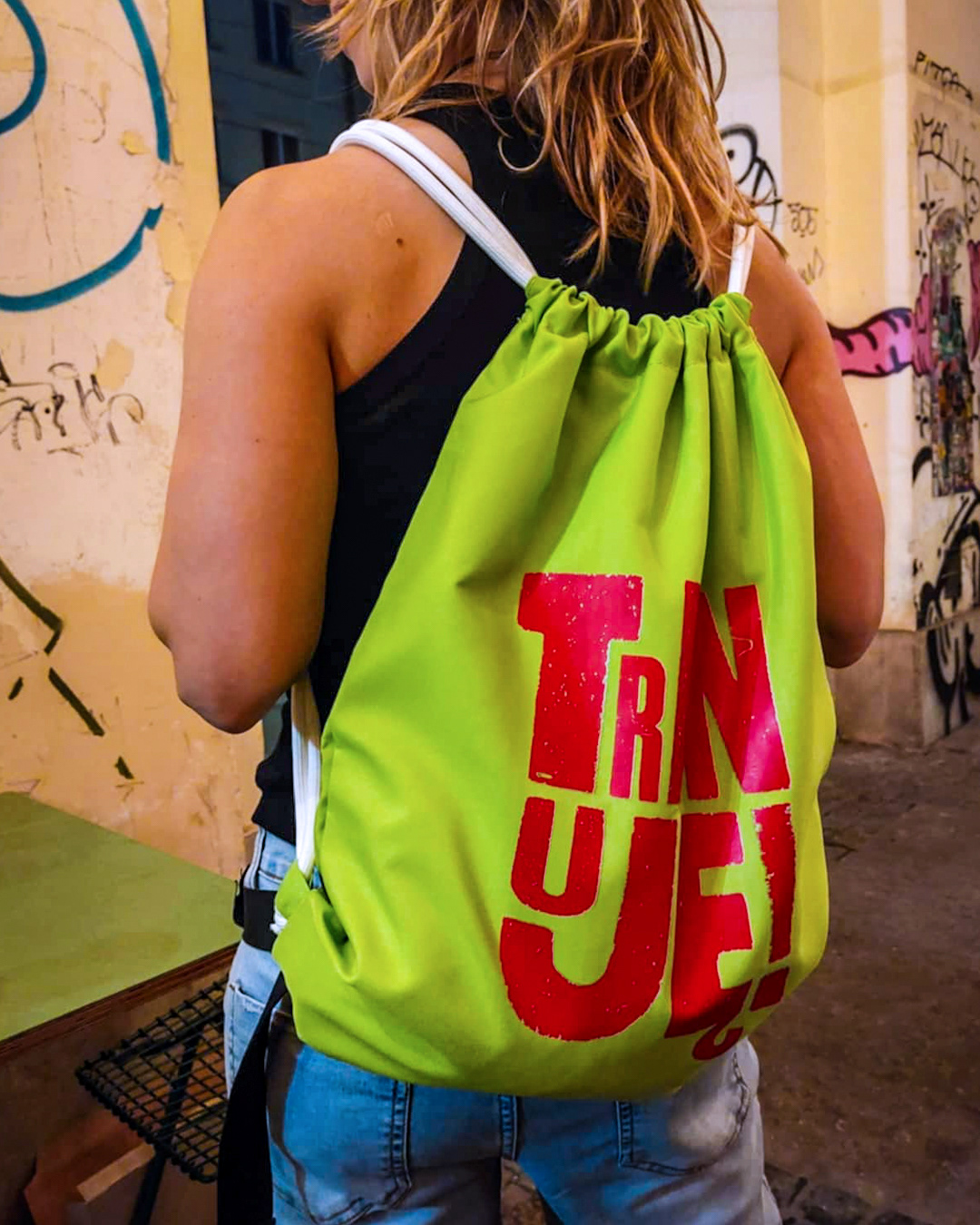
Physical Production
The first physical product was a waterproof drawstring bag featuring the typographic element 'Trenuję' (I Train). This allowed the Loco!Motion character to be manifested in a tangible object, strengthening Nicole's connection to her brand.
The 'Trenuję' bag is an example of a creative, cost-effective solution - utilising heat transfer printing - to maintain high quality while working within budget constraints.
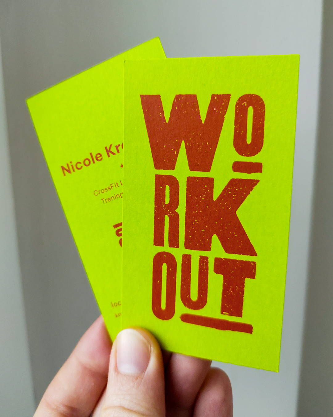
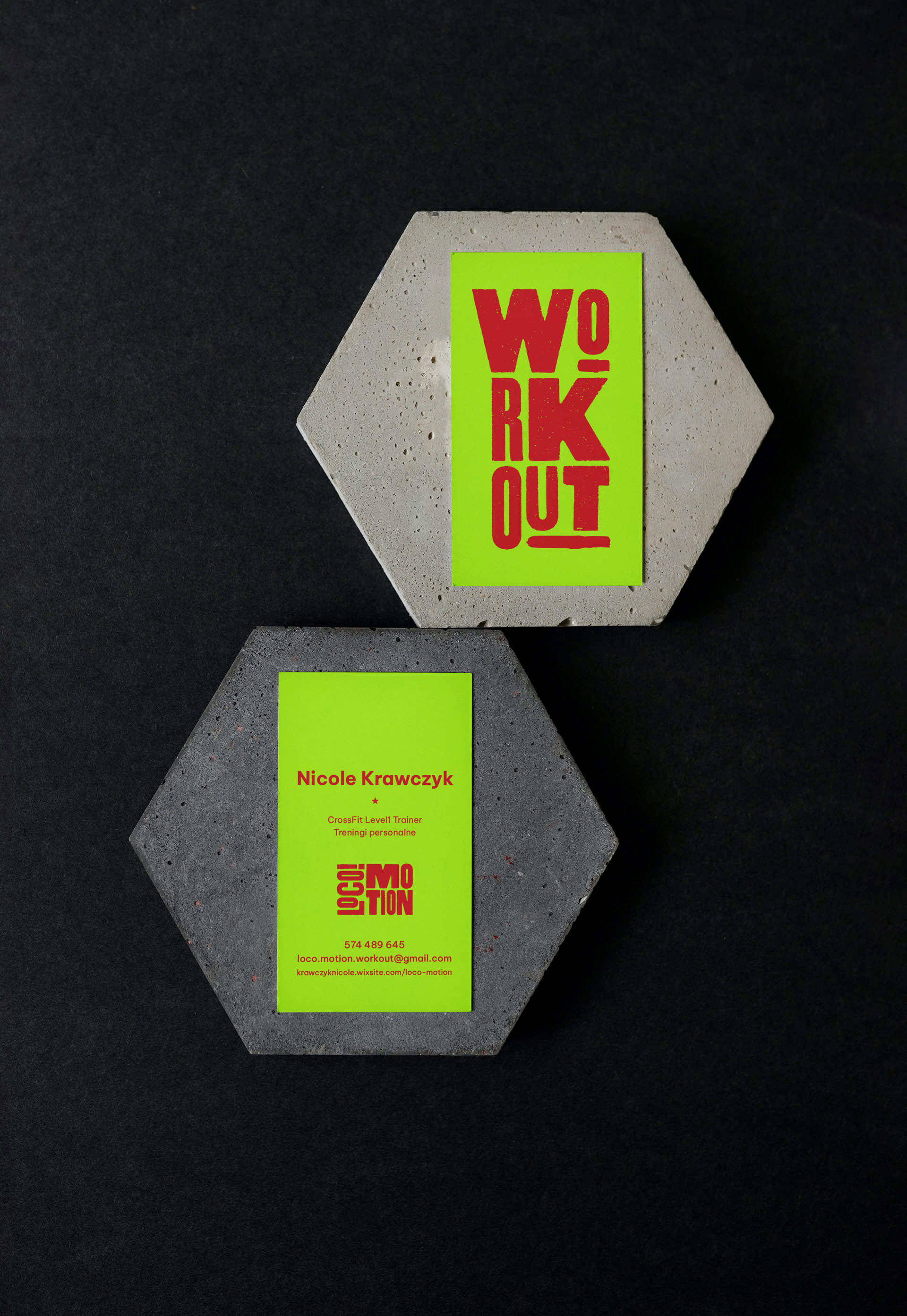
Business Cards
The business cards required a refined approach. Due to the small print run, the specific neon green colour, and the need for high-end aesthetics, standard low-budget printing was ruled out. I opted for digital printing on mass-dyed paper, which underscores Nicole’s professional authority and ensures visual consistency across her personal brand.
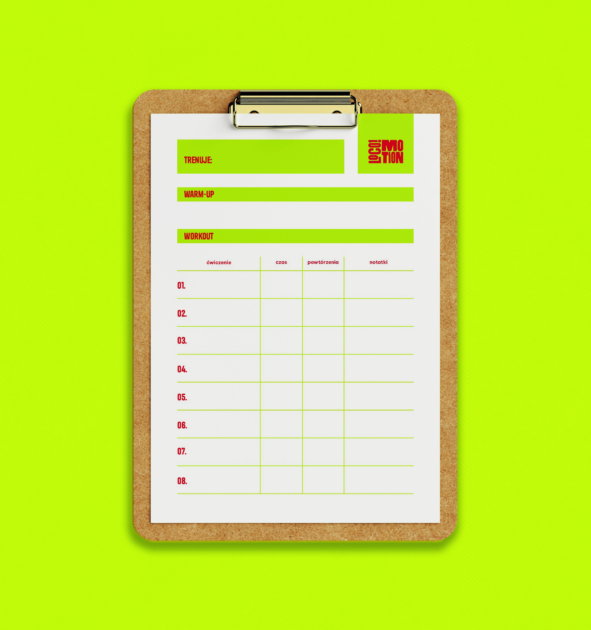
Training Plan Template
The training plan template was developed to address the specific functional requirements of Nicole’s personal training sessions. She required a document that allowed for a comprehensive workout breakdown while remaining suitable for standard A4 home printing.
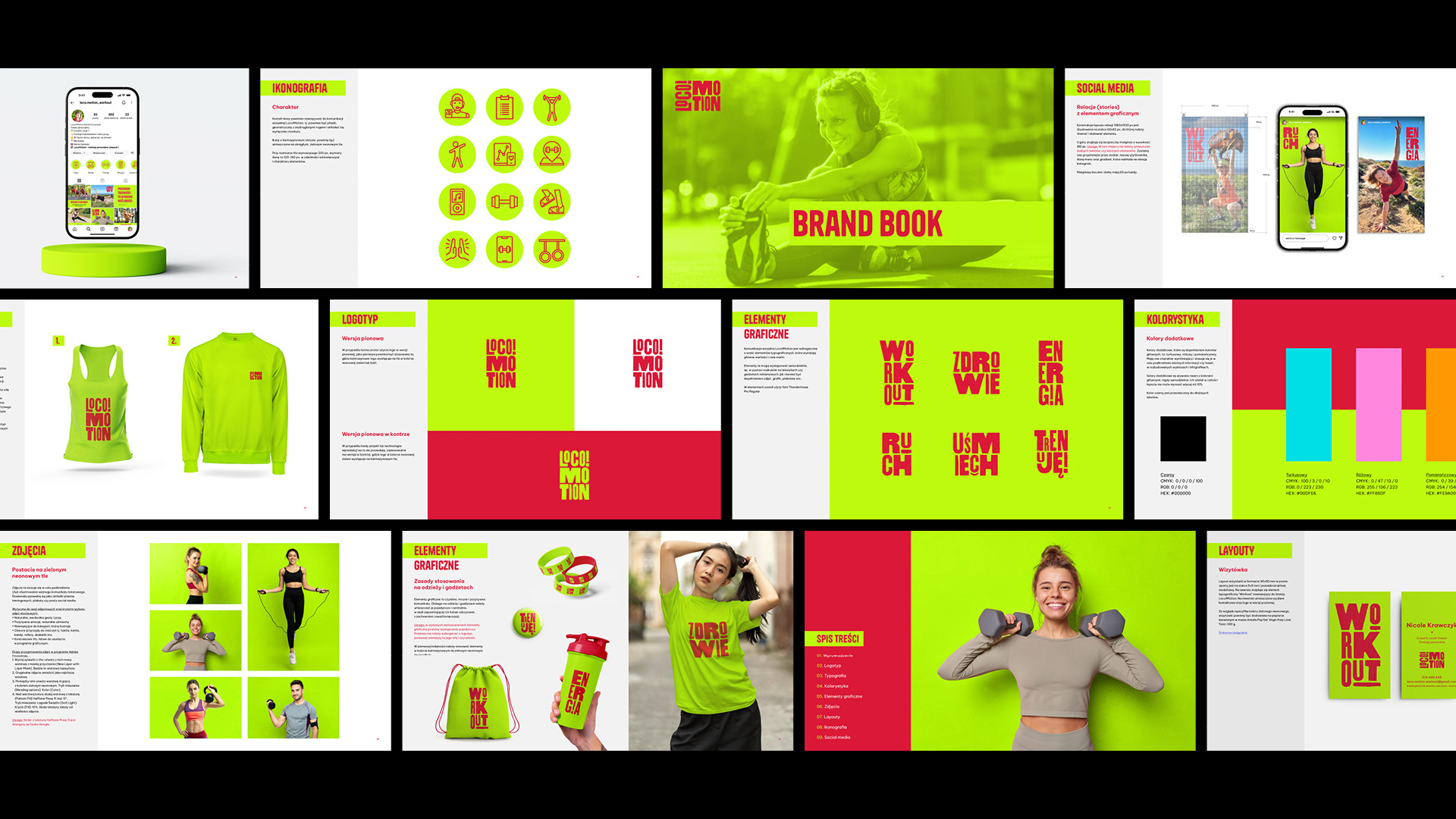
Brand Book
The Brand Book established a logical and structured framework for the creative assets. By providing detailed technical specifications, it ensures a consistent brand image is maintained across all communication channels. My objective was to empower Nicole with the essential knowledge and tools required to manage the brand's visual identity independently. I ensured that the source files provided alongside the Brand Book were tailored to Nicole’s technical proficiency and time availability. Furthermore, I provided training in the use of graphic editing software.
Results
• A cohesive and recognisable visual identity.
•Tailored and strategic brand communication.
•A comprehensive toolkit for marketing activities.
• Increased client confidence in independent brand-building.
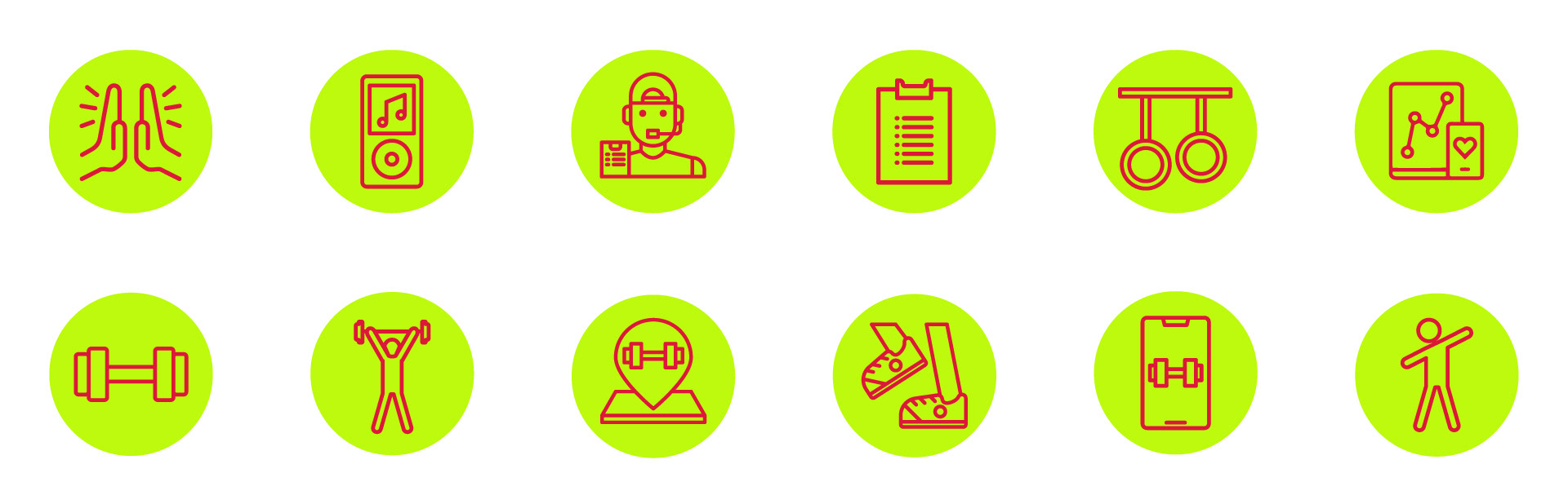
Iconography
Social media
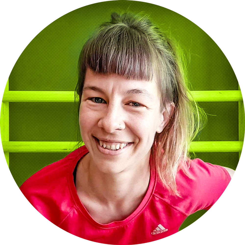
Hi! I'm Magda.
I translate brand strategy into visual language.
Let's talk.
I translate brand strategy into visual language.
Let's talk.