Scope of work:
• Foundations: analysis of the city's identity and the concept of the visual narrative.
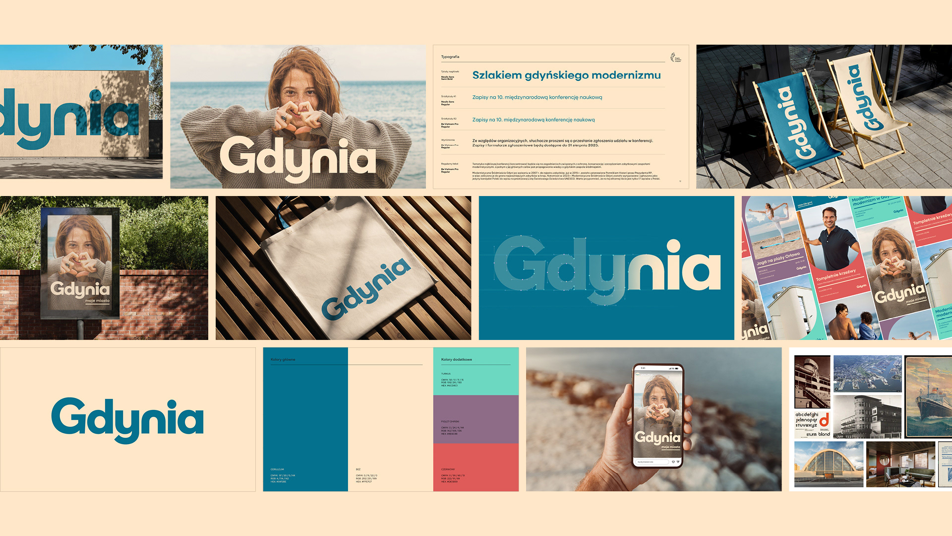
• The Mark: typographic logo corresponding to the brand assumptions.
• Visual Communication: headline and body typefaces along with their hierarchy, primary and secondary palette.
• Key Visual: visual system combining colors, typography, graphic motifs, and photography style across various formats and touchpoints.
• Brand Manual: document defining design choices, ensuring brand consistency across all communication channels.
The project was created as part of the Creative Typography course, organized by Design Practice and led by prof. ASP Mateusz Machalski. The process relied on analytical rigor, allowing for a precise translation of the city's goals and character into a visual language. The result is a system that blends artistic quality with functional design, forming a ready-to-implement framework.
| 2025 |
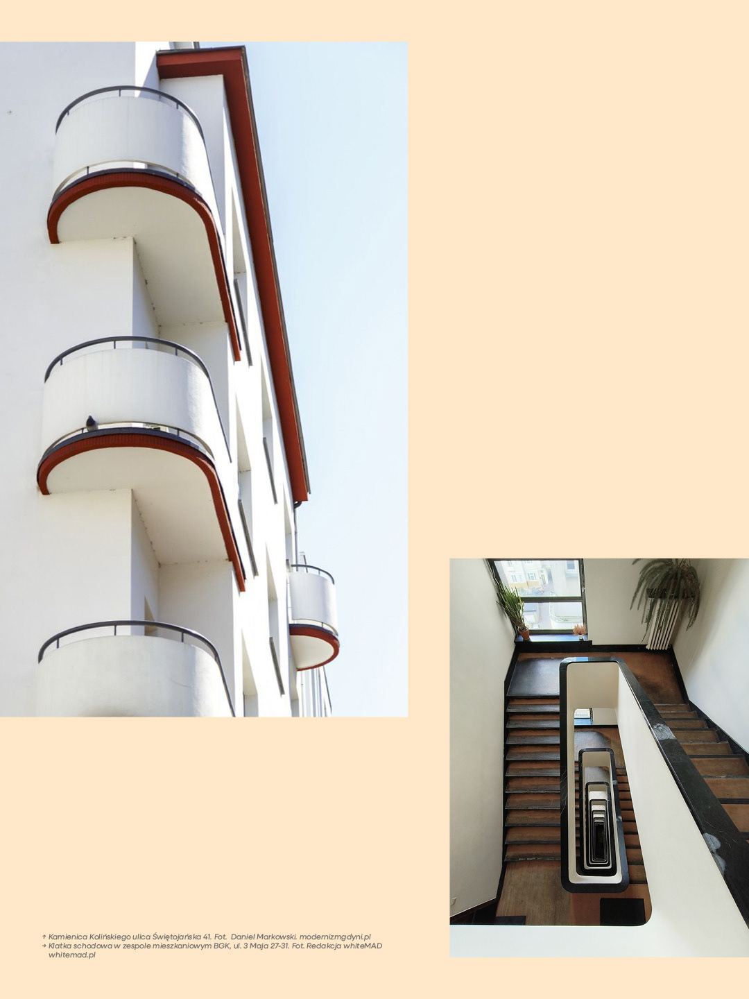
Maritime modernism as the foundation of form
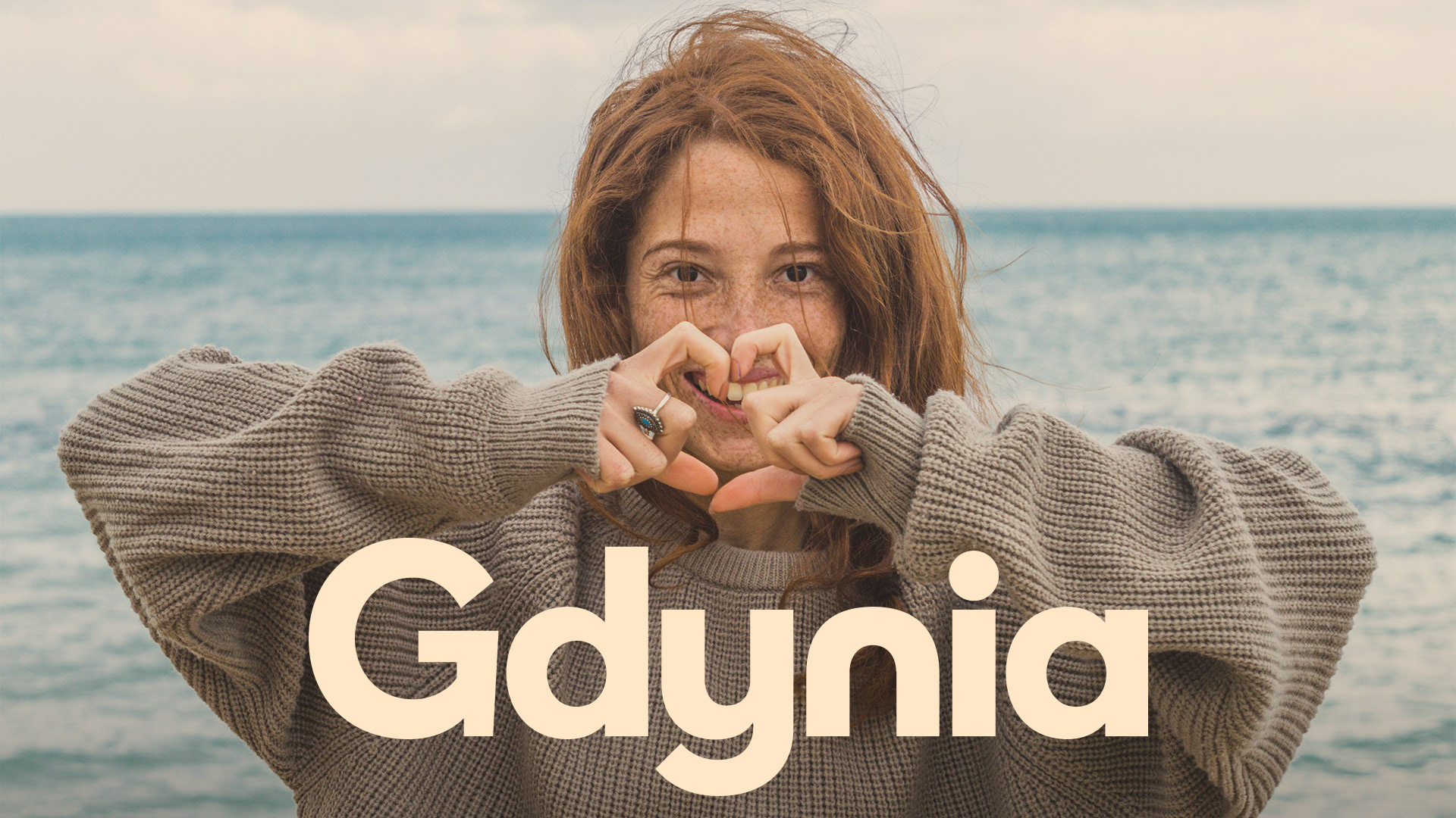
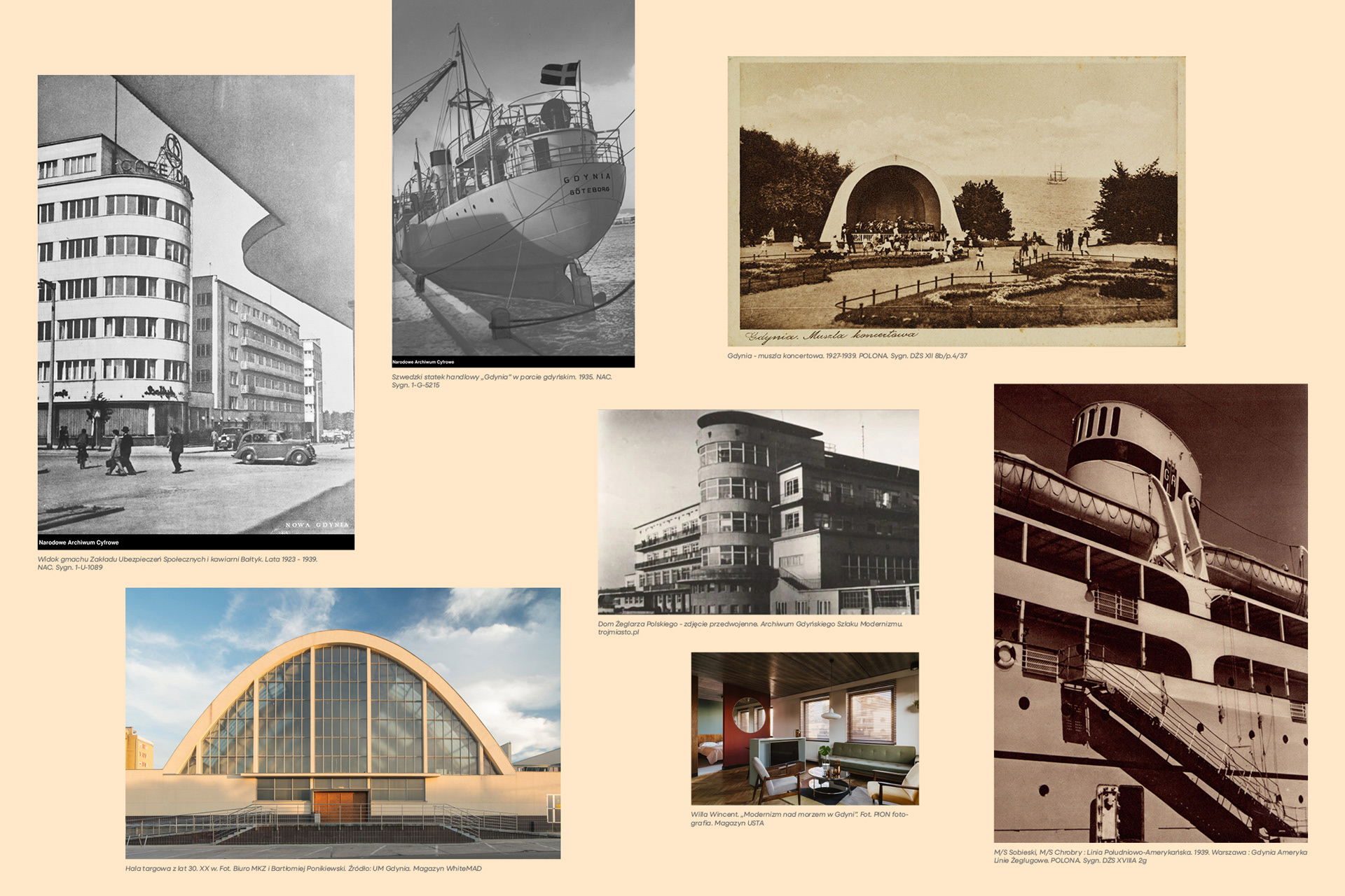
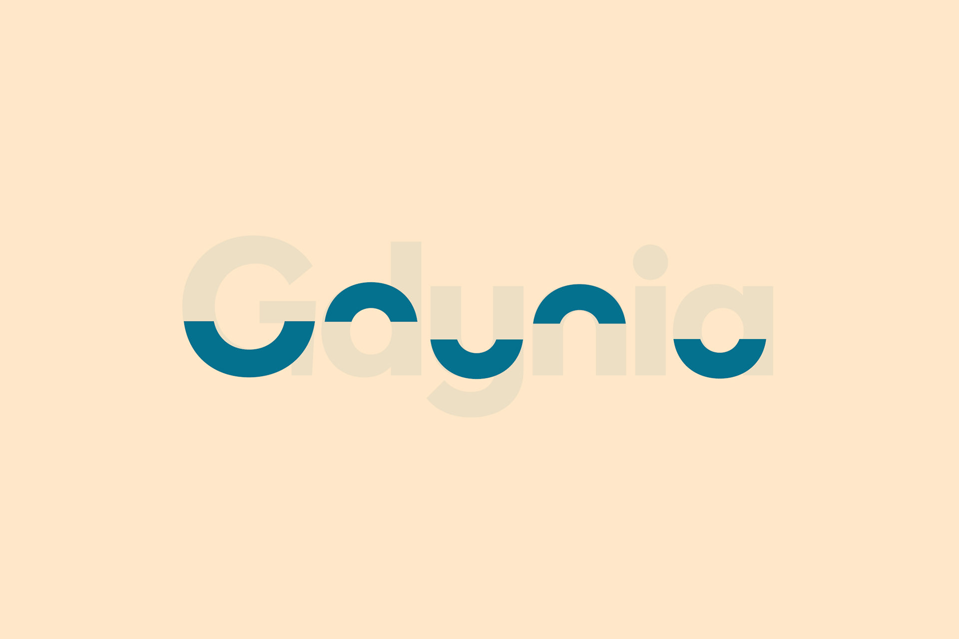
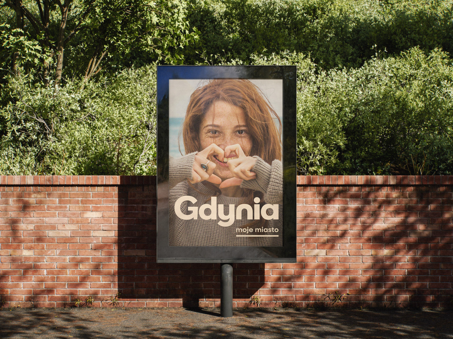
Gdynia is one of the few cities in the world where the city center was built in a single, cohesive modernist style. Curves and semi-circles soften the vertical and horizontal structural lines, creating a direct reference to the city's maritime history.
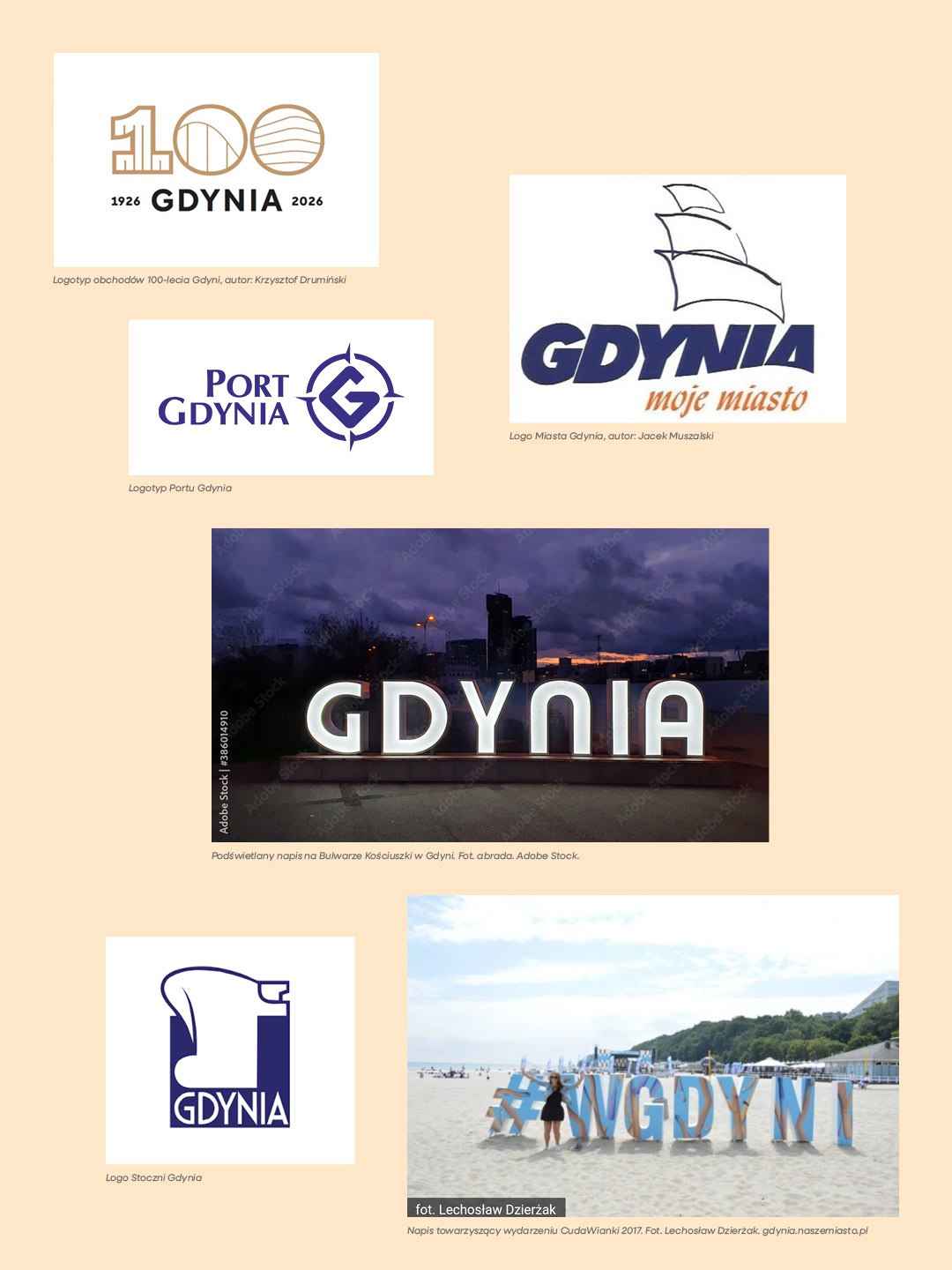
All-caps dominance
While evaluating official logos associated with Gdynia, I was struck by the prevalence of all-caps styling. Capital letters establish a formal distance, contrasting with the open and welcoming character of the city.
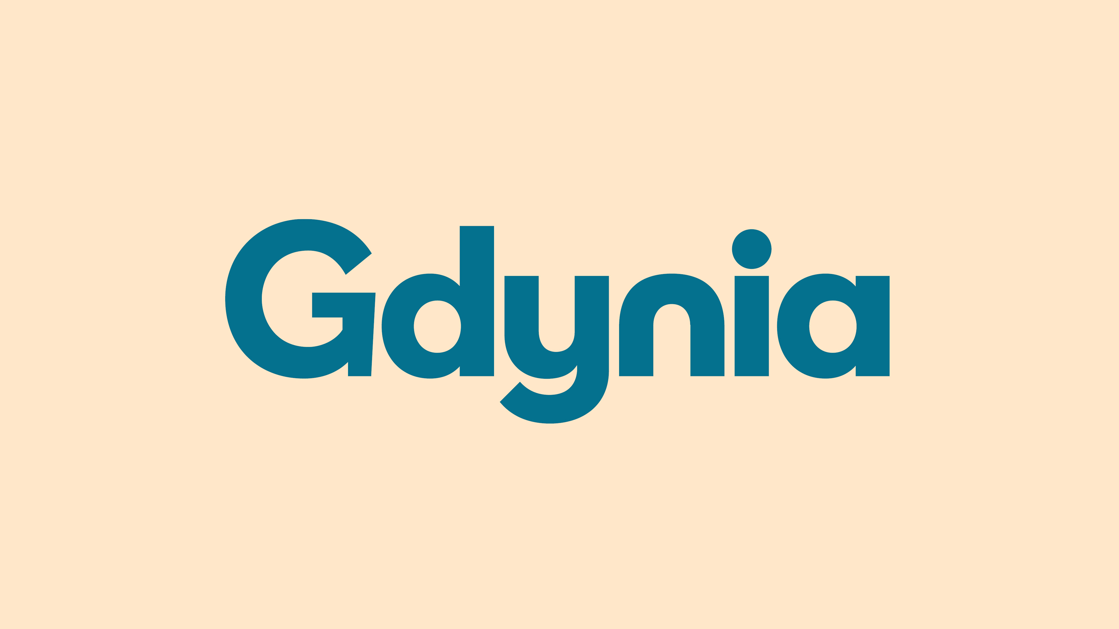
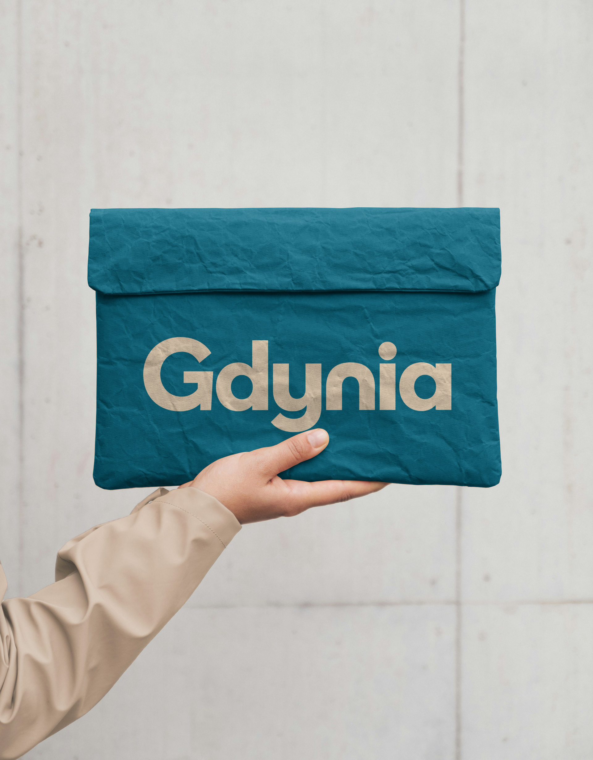
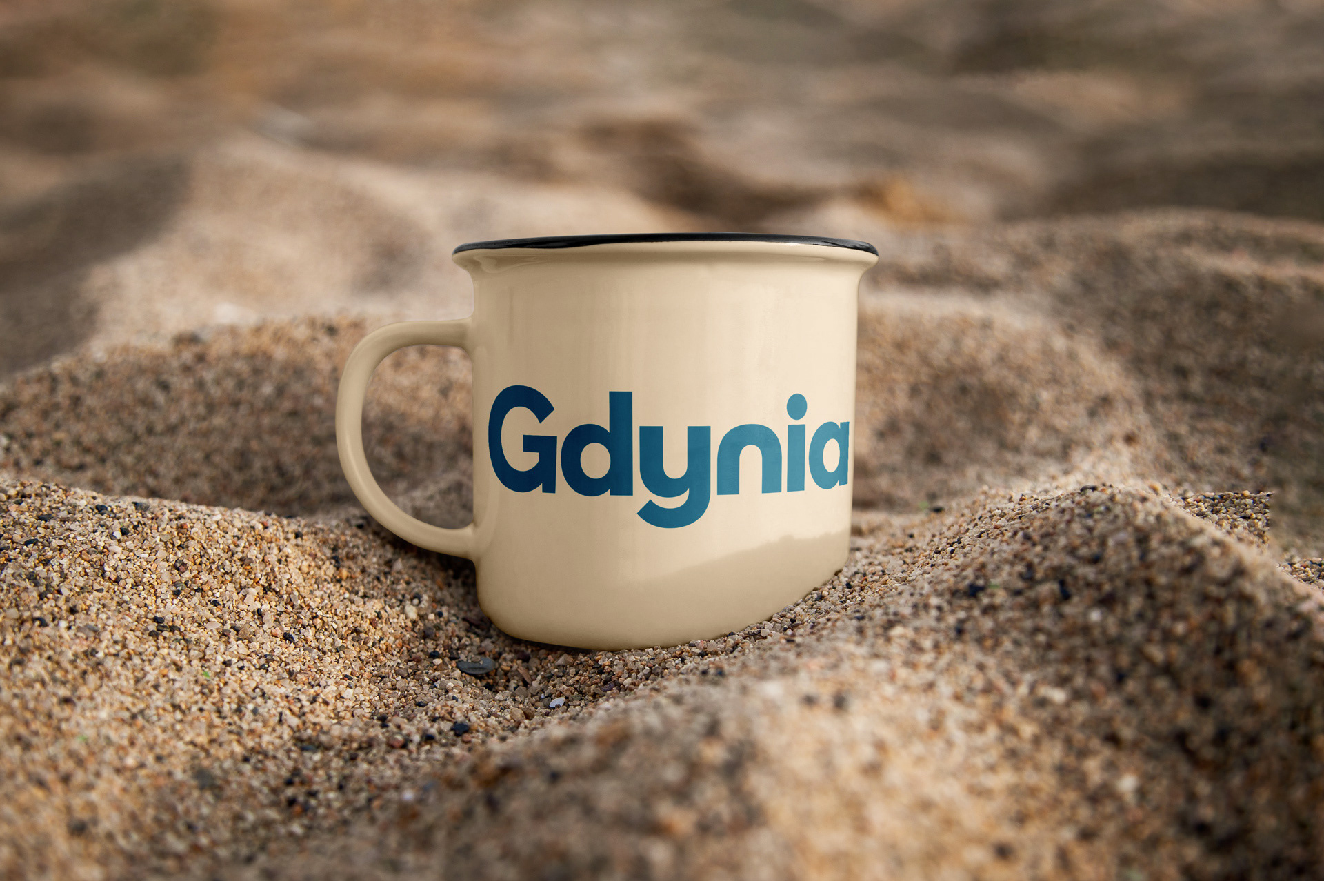
For this reason, the primary design choice was to abandon uppercase entirely. The typographic logo was developed to echo the forms of maritime modernist blocks and the shifting topography of hills and the sea.
Geometry and reportage: Sources of inspiration
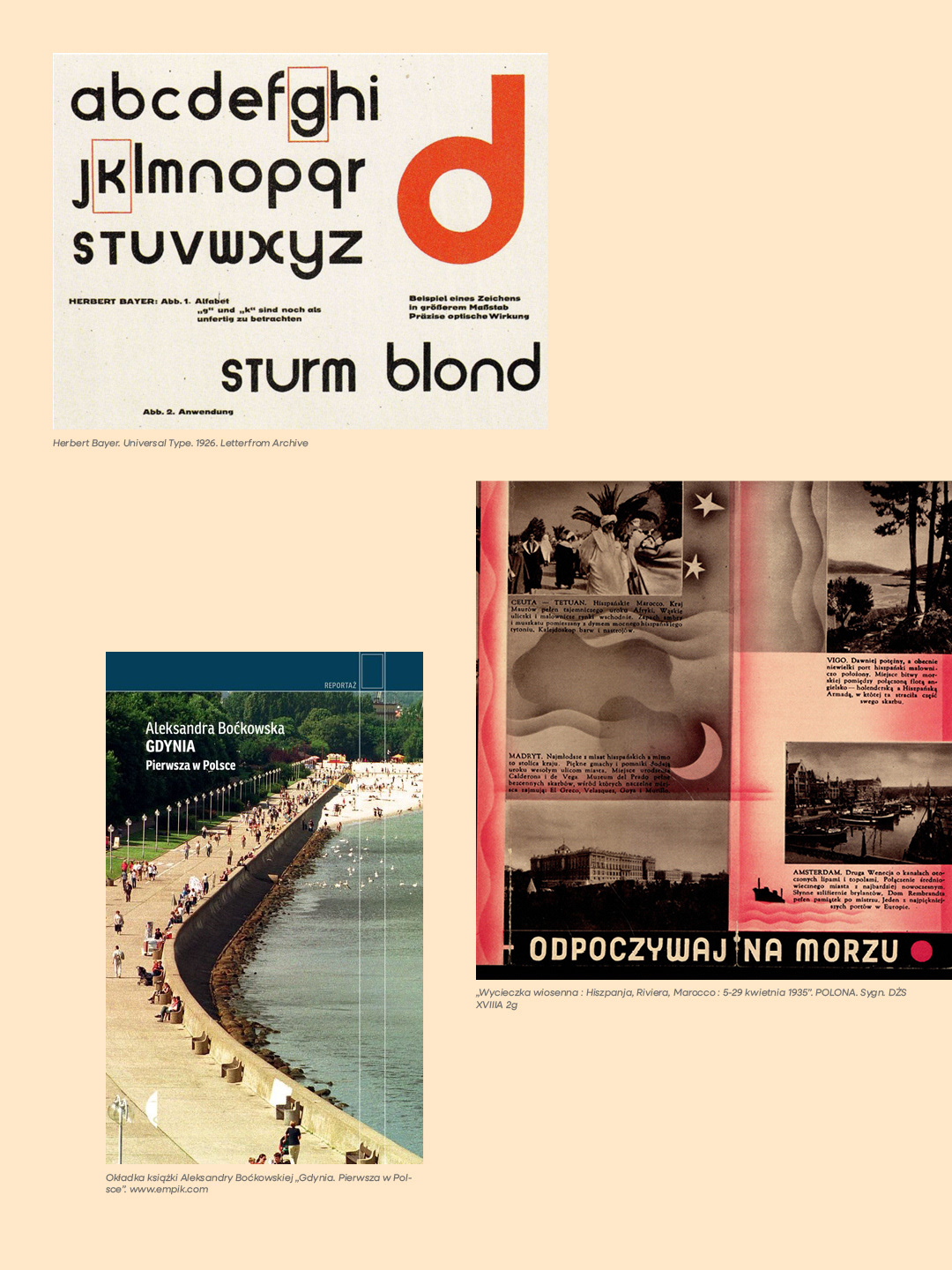
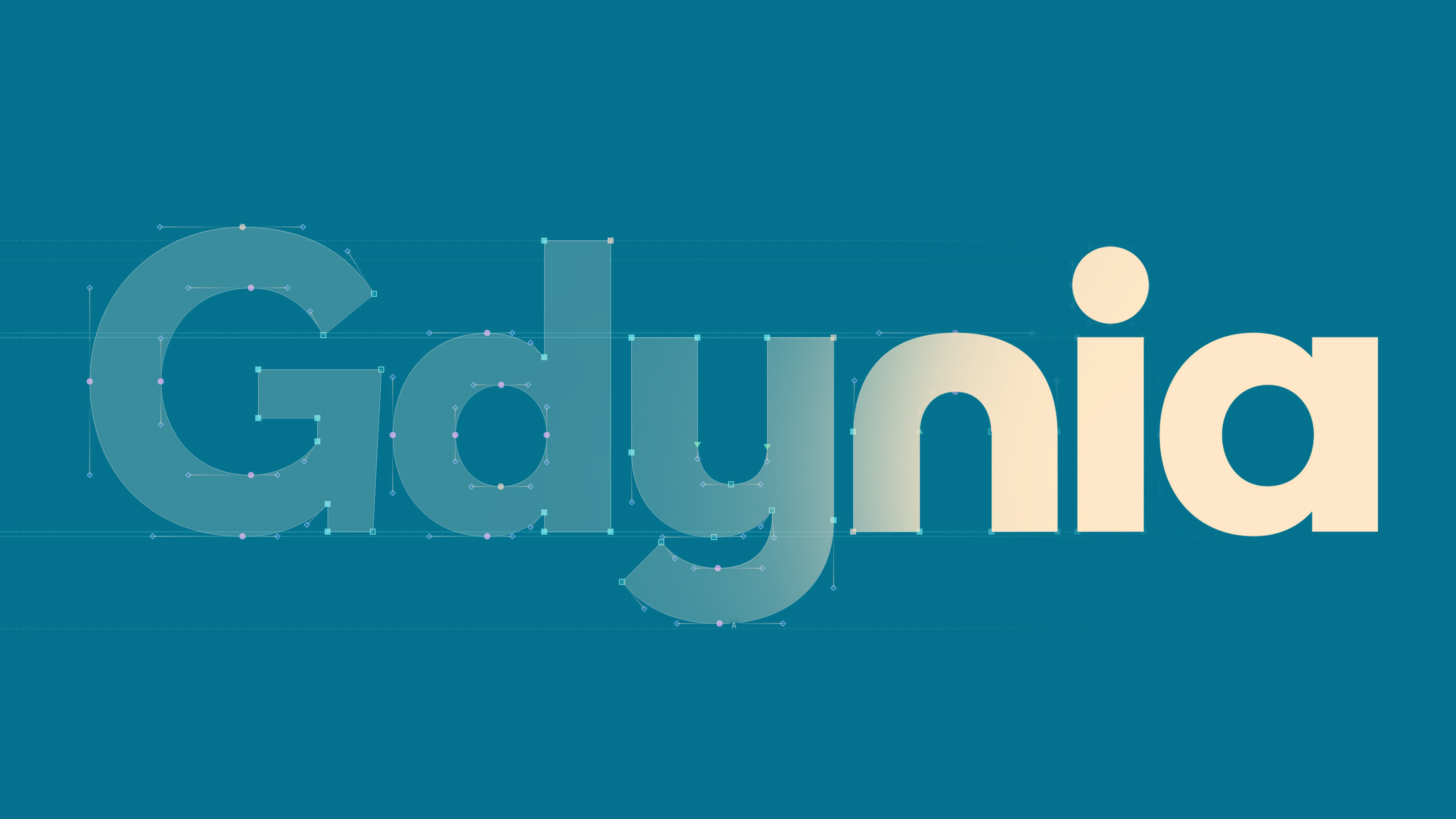
The starting point for typographic exploration was Universal Type, designed by Herbert Bayer in 1926. This geometric, sans-serif typography, its modularity, and distinct arcs guided the drawing of the mark.
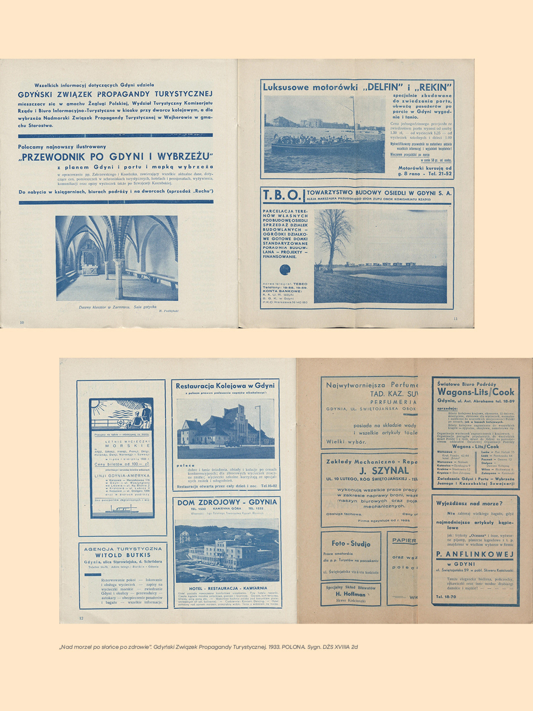
Another point of reference came from the 1930s travel brochures of the Gdynia-America Shipping Lines, which combined clear structure with organic forms.
Anna Boćkowska’s documentary book, “Gdynia. Pierwsza w Polsce” (Wydawnictwo Czarne), also played a significant role in the analytical process, providing deeper insight into the city through the personal stories and identity of its residents.
Strategic assumptions of the visual system
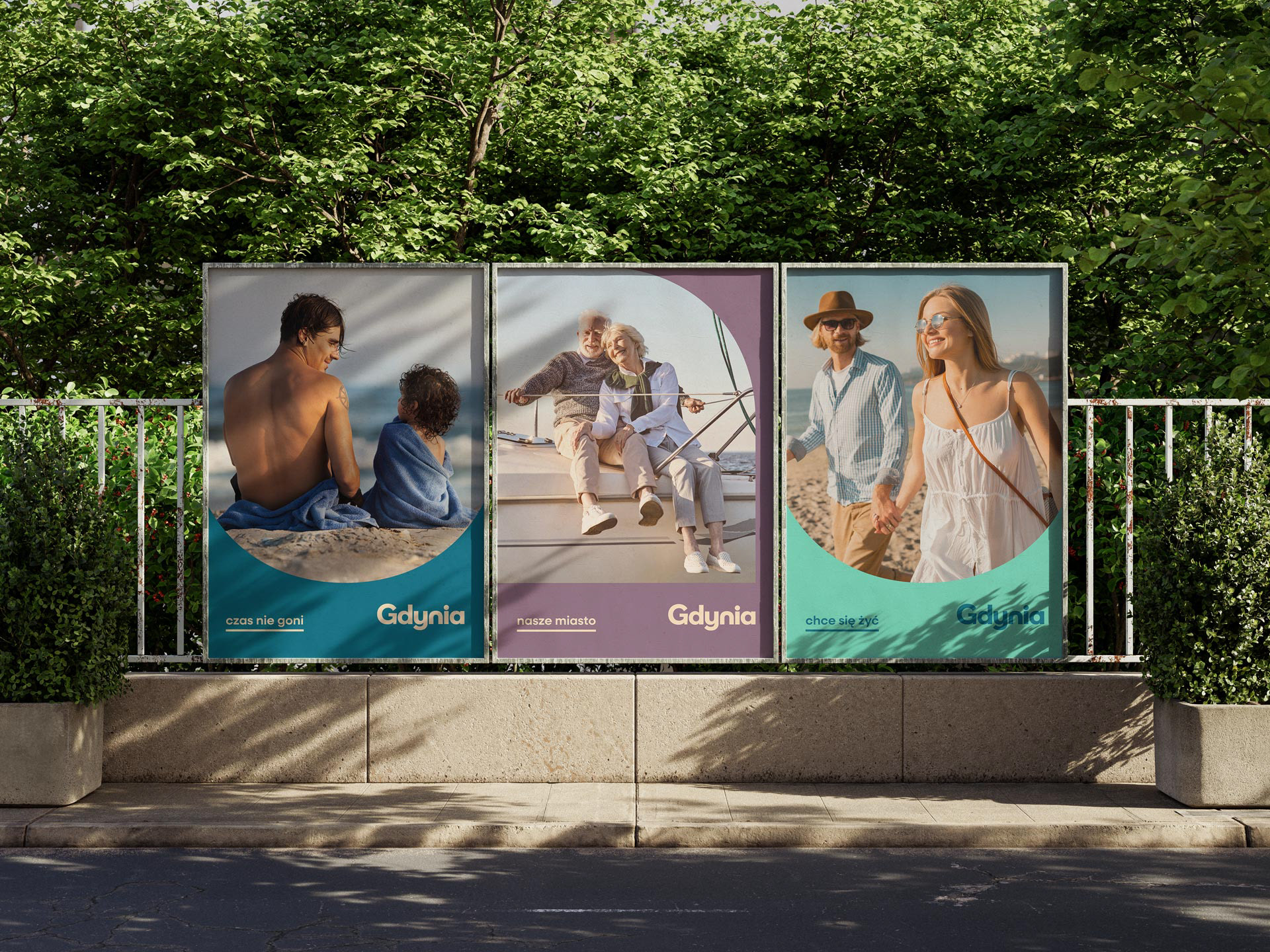
Gdynia is a young, open, and developing city with a character distinctly different from thousand-year-old Gdańsk or the resort town of Sopot. Maritime industry and transport make up the vast majority of Gdynia's economy, yet it simultaneously hosts major cultural events like the Polish Feature Film Festival, Gdynia Design Days, and the Gdynia Literary Prize gala. The city also guards its history, as seen in the Gdynia Modernism Trail, the Feast of the Sea, and the Emigration Museum.
The main objective of the visual communication system was to portray Gdynia without subjective clichés, anchoring it on three pillars:
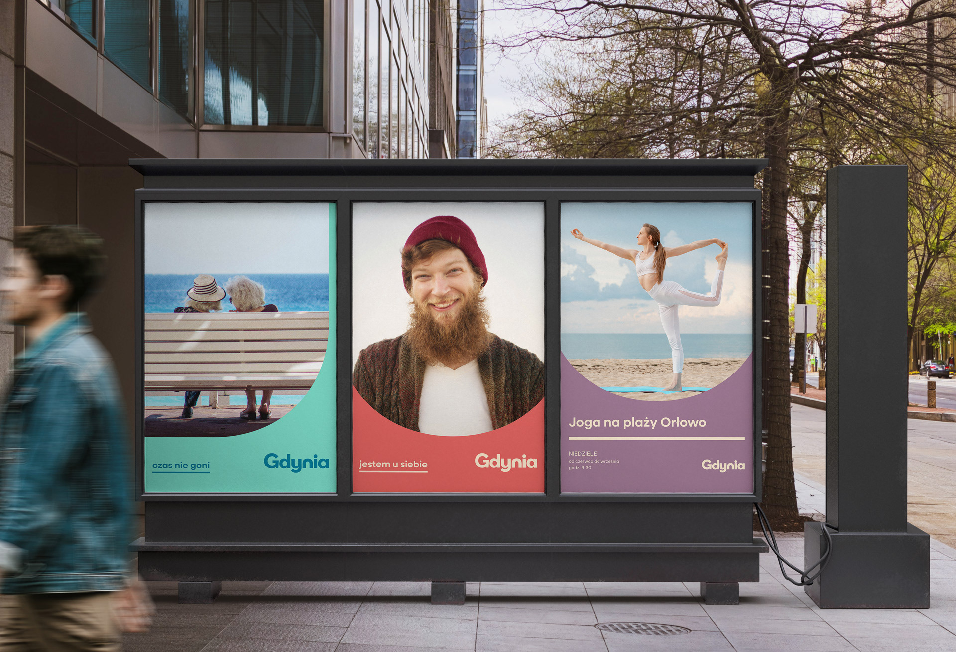
• Inclusivity – a city open and accessible to everyone.
• Friendliness – a space where people simply want to live.
• Honesty – where the maritime industry is just as vital as culture and tourism.
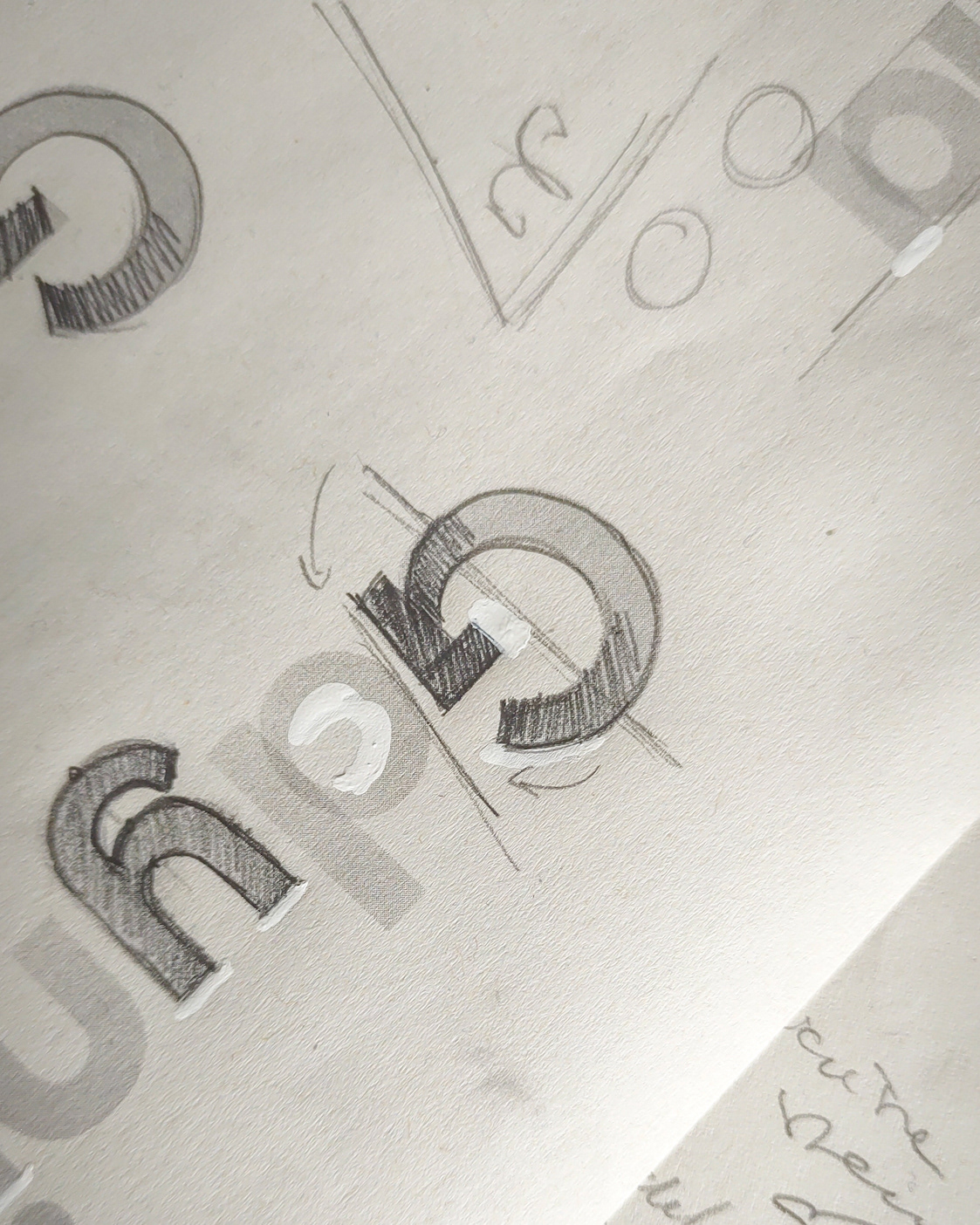
Typographic rhythm and spatial characteristics
During the work on Gdynia's typographic logo, analysing letter geometry and testing various formats for the city's name was critical. Using a lowercase 'g' obscured the character and strategic importance of a hub that operates one of the largest seaports in Poland. Conversely, a name typeset entirely in uppercase generated a formal distance, contrasting with the inclusive and open nature of the location. The natural choice was to use standard proper noun capitalization – starting with an uppercase letter.
The primary design objective was to give the emblem a form that resonates with three distinct characteristics of the city:
• the nautical style, which forms the foundation of Gdynia’s modernist architecture;
• the hilly topography of the surrounding landscape;
• the rhythm of sea waves.
The structure of the word 'Gdynia' inherently supports this concept. The construction of individual letters relies on recurring shape families, which enabled the development of a cohesive, geometric rhythm throughout the logotype.
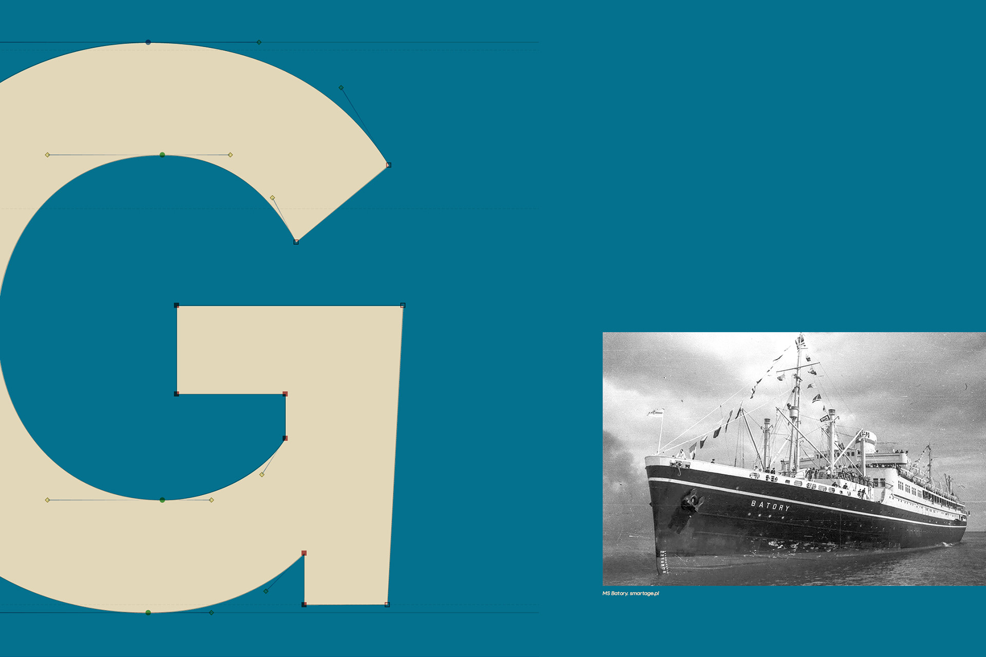
A detail with historical context
The final element of formal synthesis is the modification of the letter 'G'. The diagonal cut of its stem directly references the silhouette and bow shape of Polish transatlantic ocean liners, which operated the regular Gdynia–America Line during the interwar period. This lettering detail links a modern visual identity with the historical identity of the place.
Typefaces and hierarchy
Neulis Sans SemiBold, designed by Adam Ladd, was applied as the headline typeface. The expanded proportions of its letterforms correspond directly with the geometry of the logotype. Conversely, for subheadings and longer bodies of text, the more neutral Be Vietnam Pro Regular was selected. It shares a similar character while ensuring optimal readability across diverse formats.
A distinct line with diagonally cut terminals separates the headlines from the text layout. This structural element serves as a direct reference to the layout design of 1930s tourism brochures.
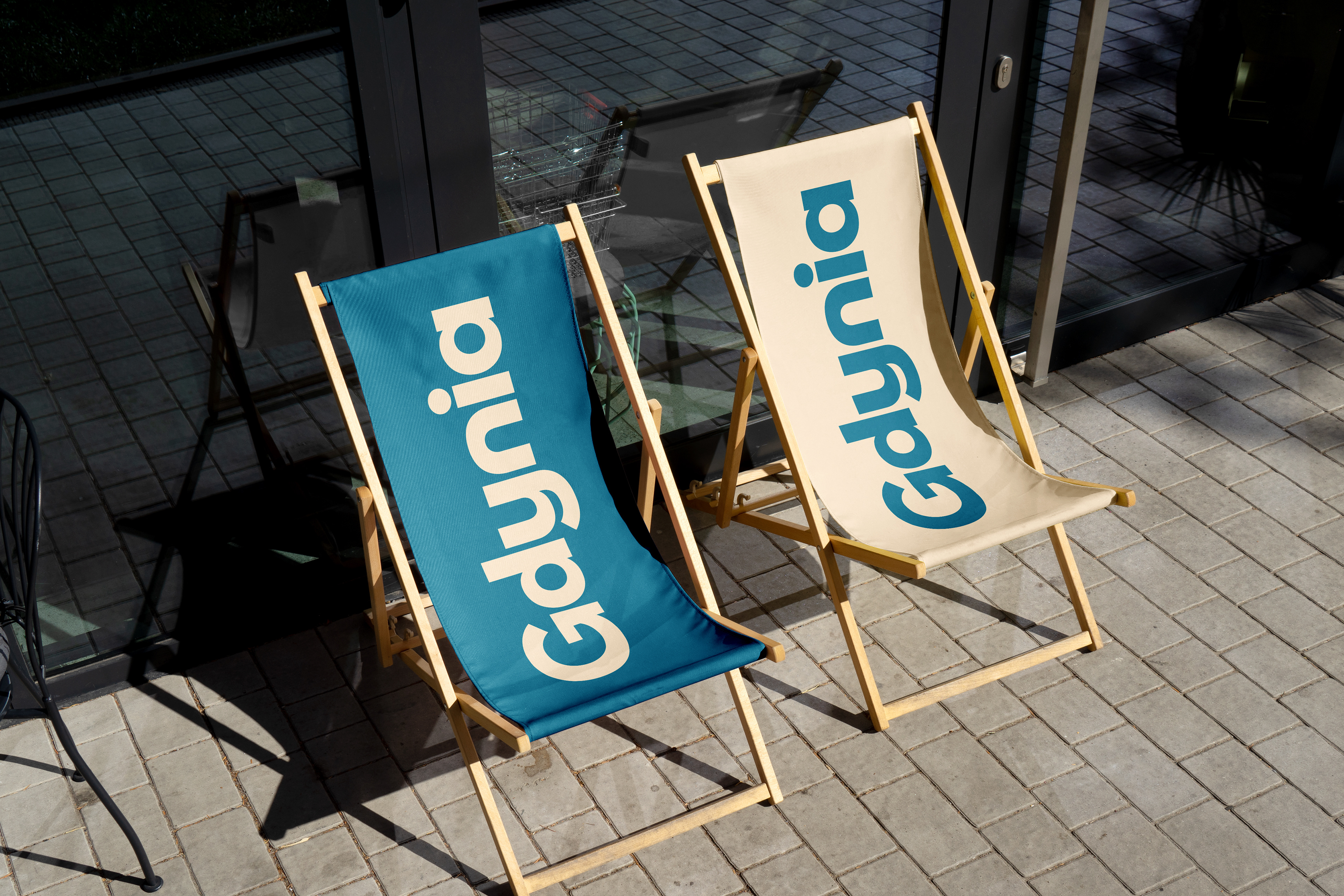
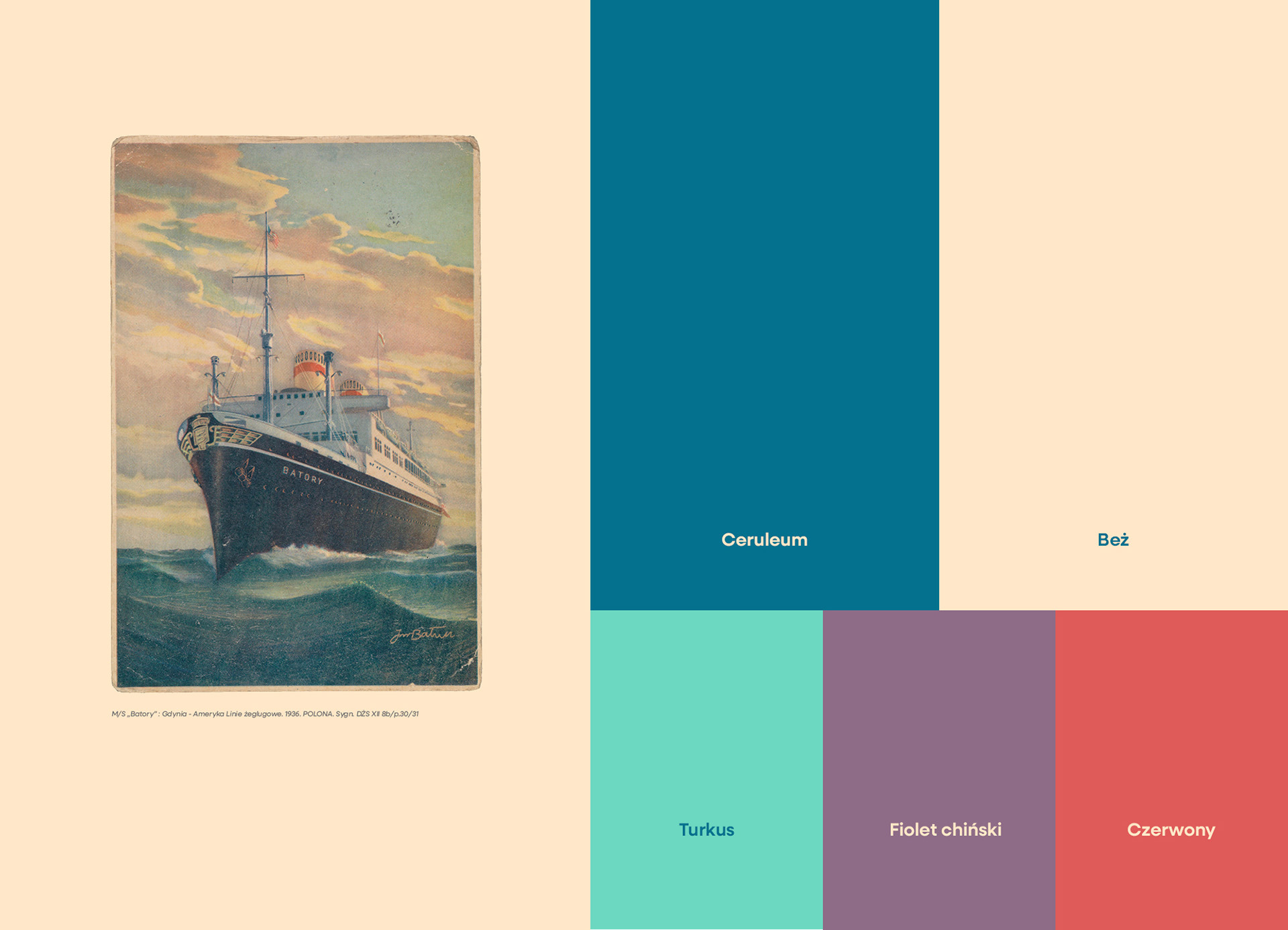
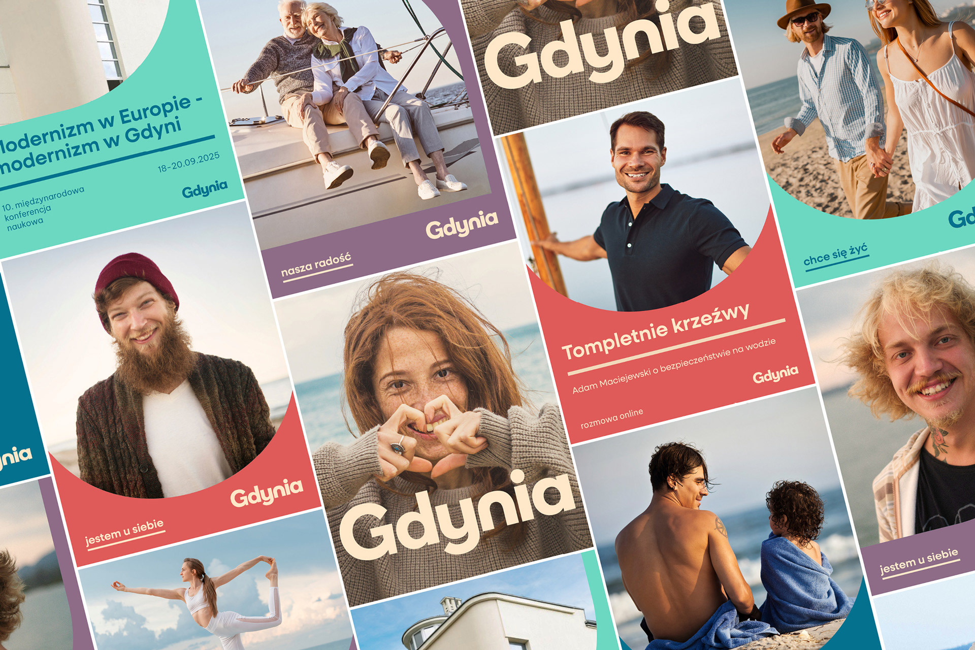
Colour palette
The colour system is warm and muted. The direct inspiration was Jan Bałun’s painting depicting the transatlantic ocean liner M/S "Batory", which operated on the Gdynia–America route during the interwar period. The selected colours reflect the core concepts of openness and the native identity of the coastal hub, intentionally moving away from purely tourist-oriented combinations.
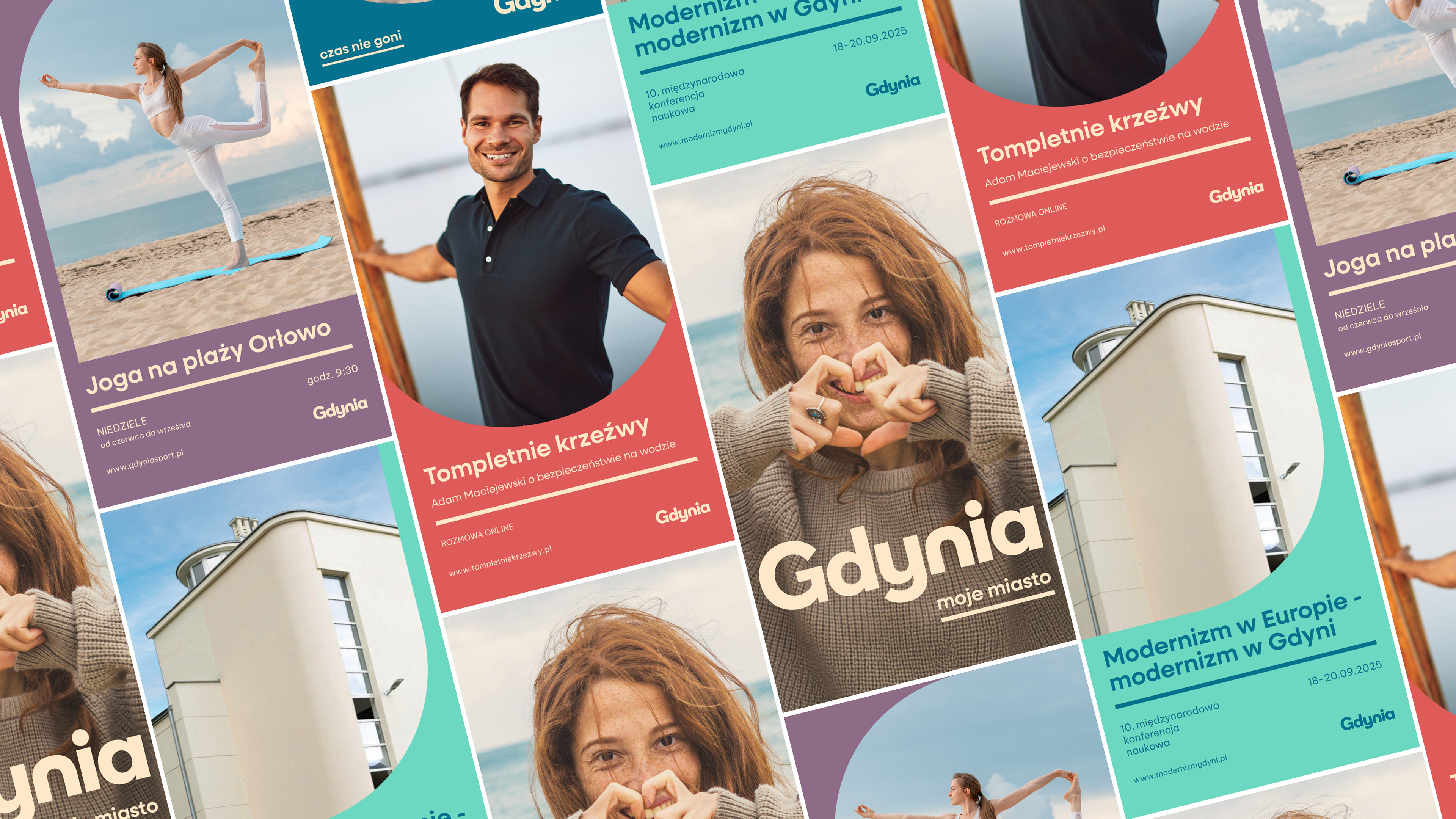
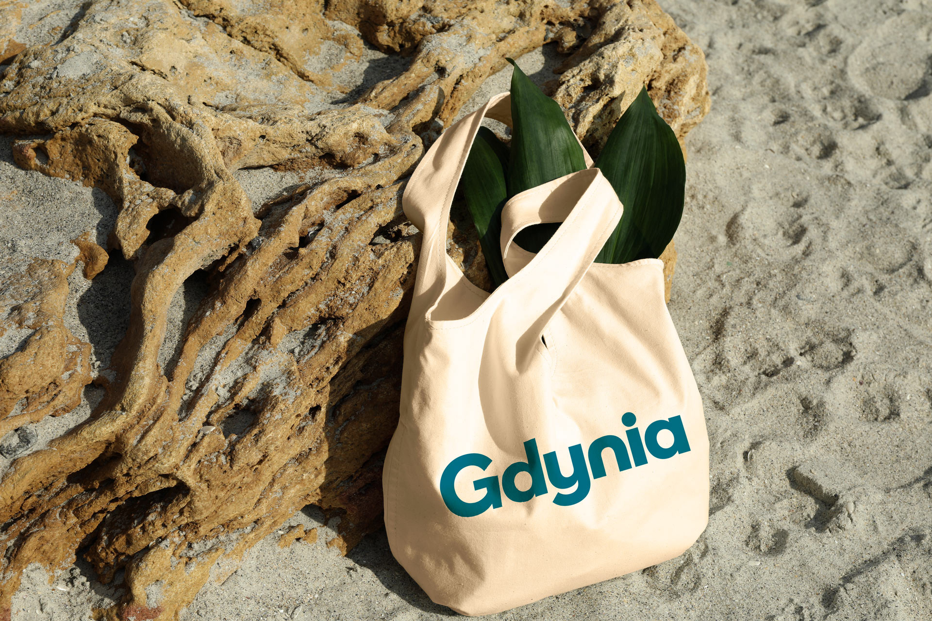
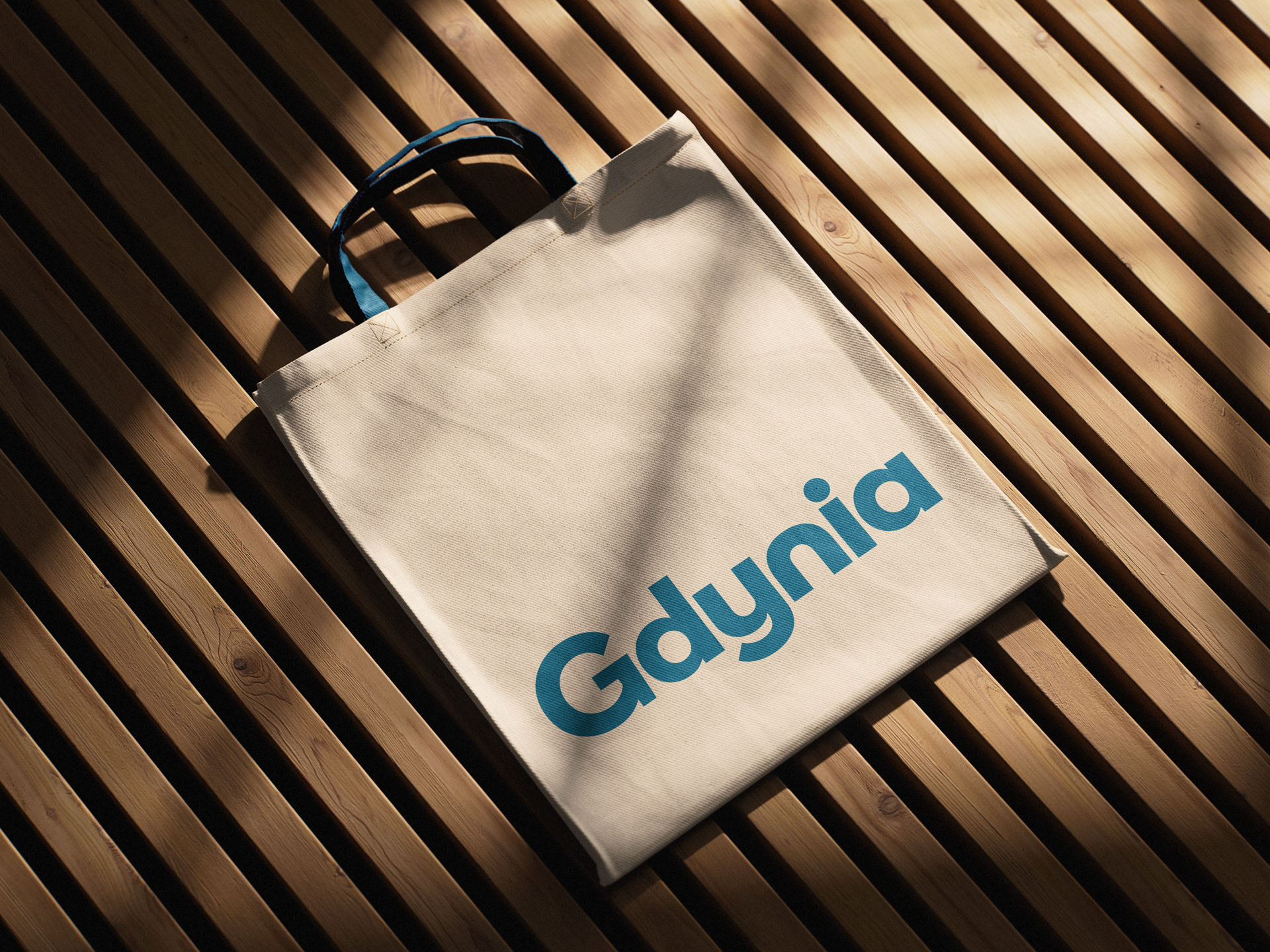
Flexible key visual
The coherent communication architecture is completed by a modular key visual. Arcs and semi-circles within the layouts introduce softness and mitigate sharp divisions, recreating the city's maritime character and its hilly topography across both online and offline spaces. As a result, the key visual forms a flexible system that functions consistently and cohesively across every brand communication channel.
Brand Manual from a user perspective
Developing a Brand Manual or a Brand Book may seem like a purely technical process devoid of creativity. In reality, its primary purpose is to optimize the work of teams and external subcontractors – including people who are not involved in creation on a daily basis.
This document functions as a user guide, where presenting information accessibly and explaining industry terms becomes crucial. When designing a Brand Manual, I adopt the perspective of a person not professionally related to design, which allows me to anticipate the challenges the team will face.
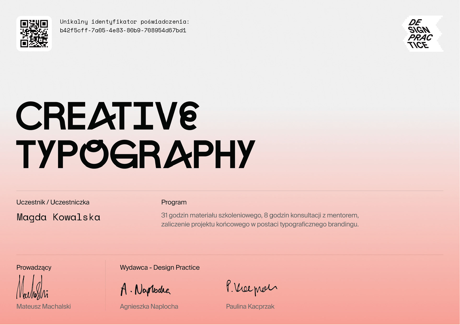
An award for aesthetics
The project for Gdynia was created as a final assignment for the Creative Typography course organized by Design Practice and led by Mateusz Machalski, Professor at the Academy of Fine Arts in Warsaw. Mateusz recognized the project as exceptionally aesthetic, awarding it the unofficial status of a candy.
Hi Magda,
So sorry for the delay! Mateusz marked your project with a "Candy" status (exceptionally aesthetic, congratulations!), which is why it didn't register under the standard "Certificate to be sent" statuses. The project is fully passed, and the certificates should be in your inbox by now. :)
Hi! I'm Magda.
I translate brand strategy into visual language.
Let's talk.